ggplot 设计思路 学习笔记
2020-03-18
- 使用 RMarkdown 的
child参数,进行文档拼接。 - 这样拼接以后的笔记方便复习。
- 相关问题提交到 Issue
参考 Barrett (2019)
1 去冗余

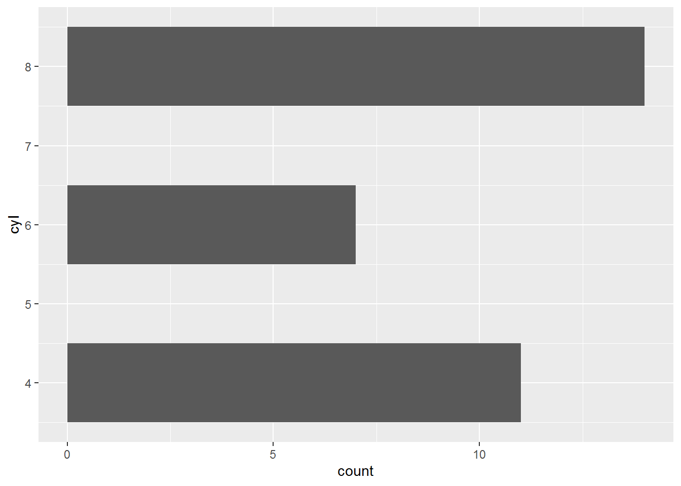
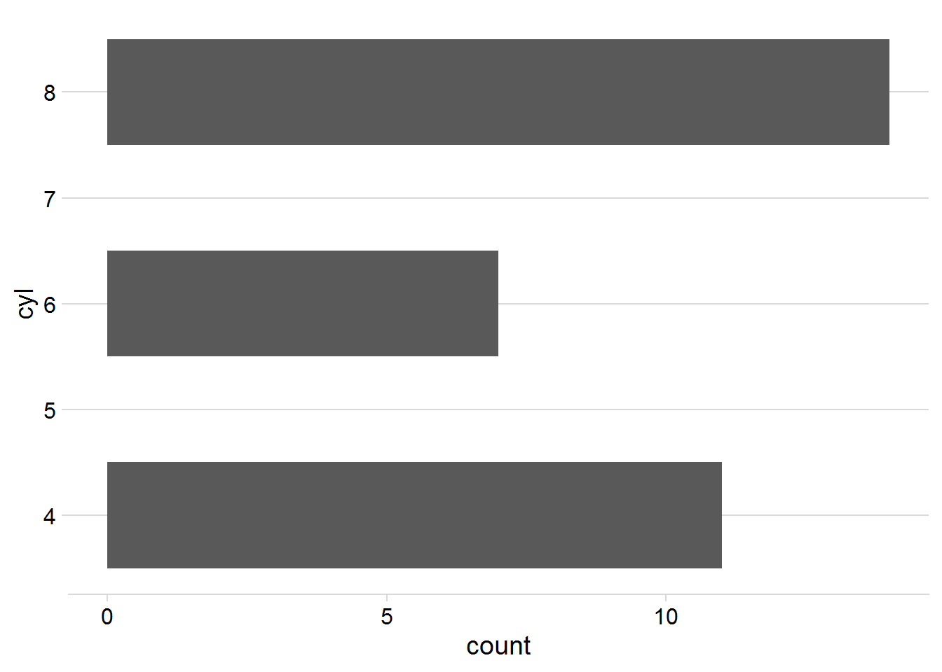
# theme_minimal(14) 根据实际情况,调整图像对象大小
# theme(panel.grid.minor = element_blank()) 删除多余的线
p +
    cowplot::theme_minimal_grid()

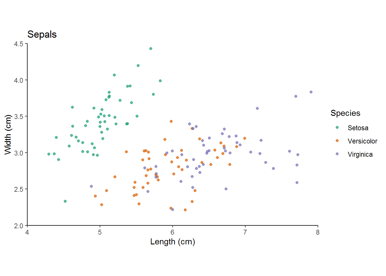
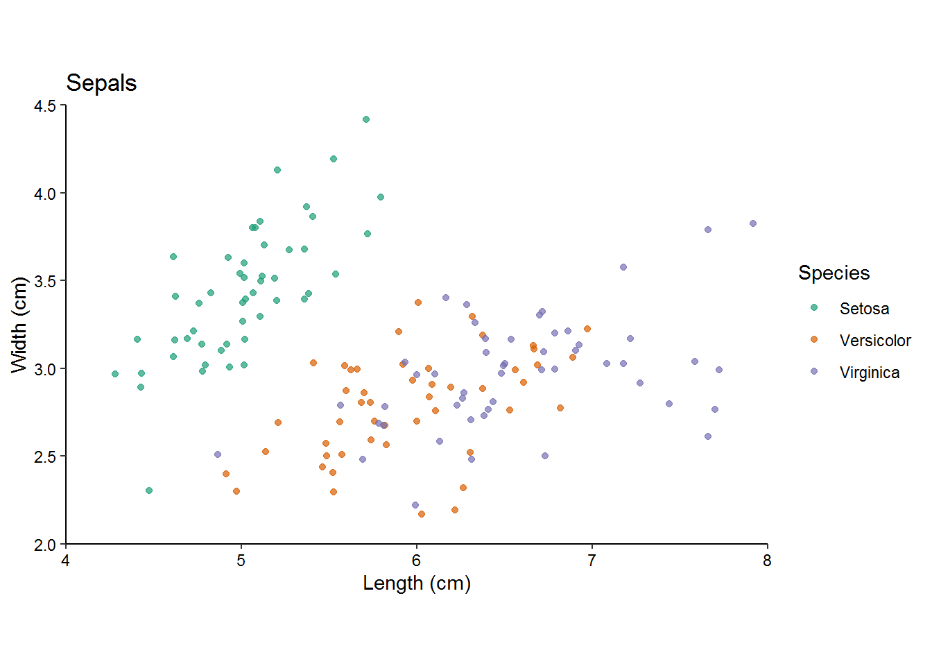
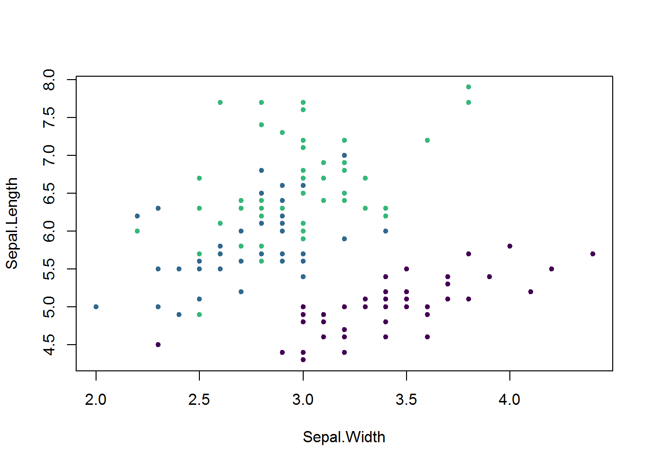
z <-
    ggplot(iris, aes(x = Sepal.Length, y = Sepal.Width, col = Species)) +
    geom_jitter(alpha = 0.7) +
    scale_color_brewer(
        "Species",
        palette = "Dark2",
        labels = c("Setosa",
                   "Versicolor",
                   "Virginica")
    ) +
    scale_y_continuous("Width (cm)",
                       limits = c(2, 4.5),
                       expand = c(0, 0)) +
    scale_x_continuous("Length (cm)", limits = c(4, 8), expand = c(0, 0)) +
    ggtitle("Sepals") +
    coord_fixed(1)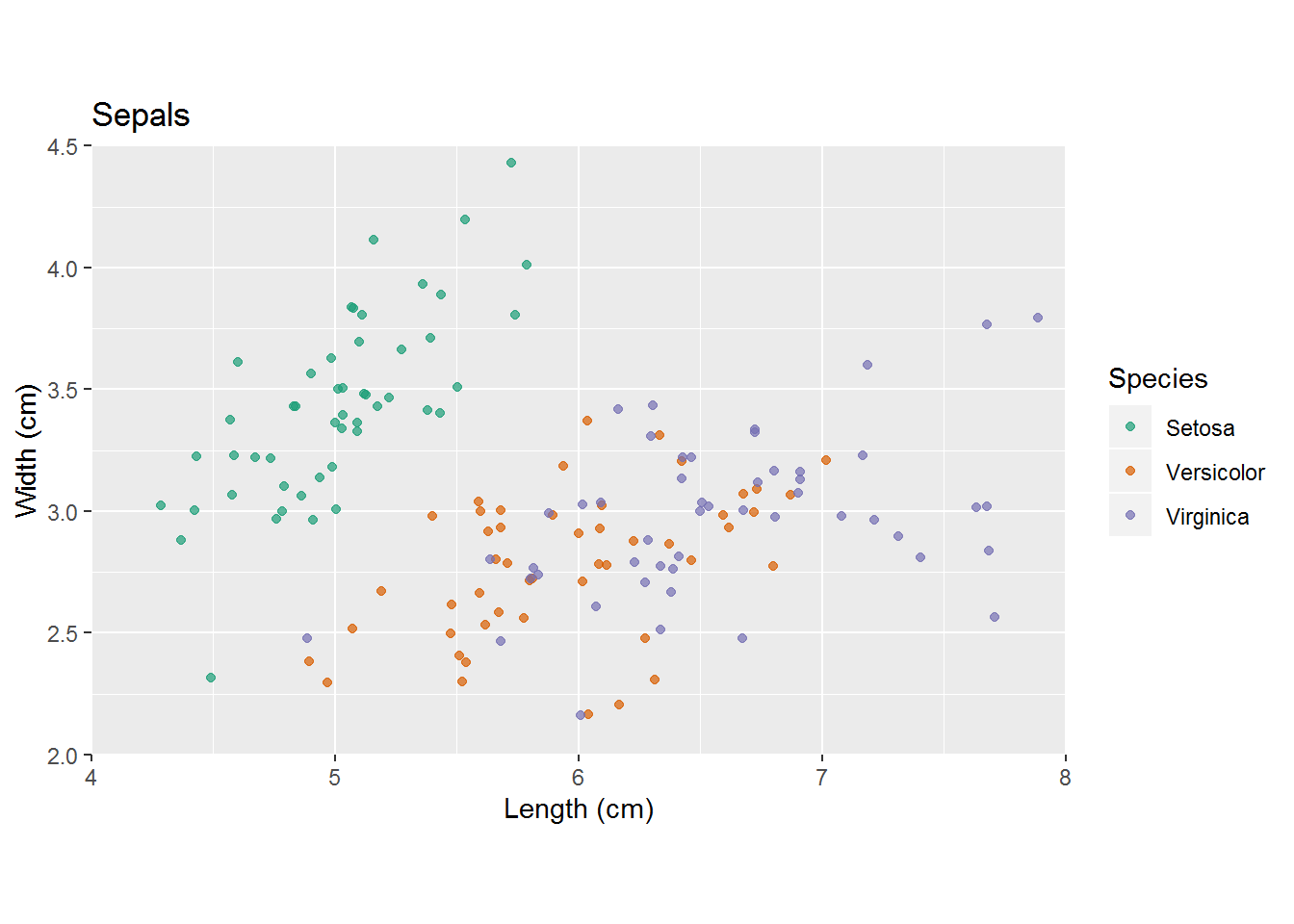
1.1 文字不重叠
devtools::load_all()
library(ggrepel)
p1 <-
    gapminder::gapminder %>%
    filter(year == 2007) %>%
    ggplot(aes(x = log(gdpPercap), y = lifeExp)) +
    geom_point(
        size = 3.5,
        alpha = .9,
        shape = 21,
        col = "white",
        fill = "#0162B2"
    ) +
    theme(panel.grid.minor = element_blank()) +
    labs(x = "log(GDP per capita)",
         y = "life expectancy")
p1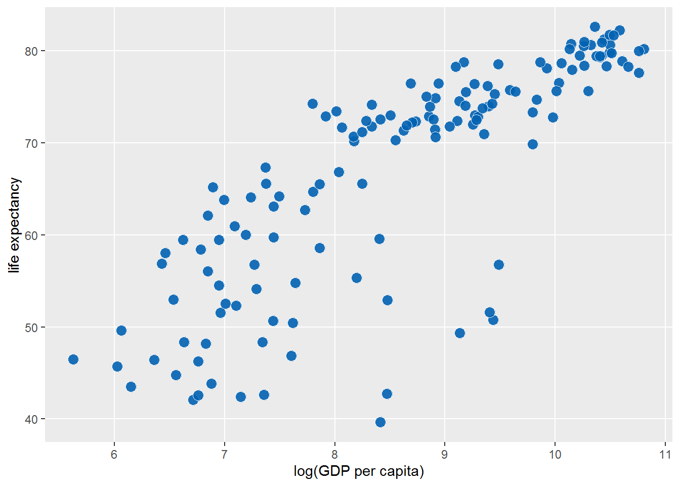
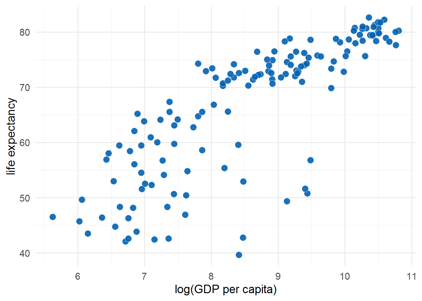
library(gapminder)
set.seed(42)
ten_countries <- gapminder$country %>%
    levels() %>%
    sample(10)
ten_countries
## [1] "Ghana" "Italy" "Lesotho" "Swaziland" "Zimbabwe"
## [6] "Thailand" "Gambia" "Chile" "Korea, Rep." "Paraguay"p1 <- gapminder %>%
filter(year == 2007) %>%
mutate(label = ifelse(country %in% ten_countries,
as.character(country),
"")) %>%
ggplot(aes(log(gdpPercap), lifeExp)) +
geom_point(
size = 3.5,
alpha = .9,
shape = 21,
col = "white",
fill = "#0162B2"
)
p1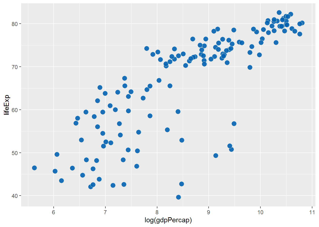
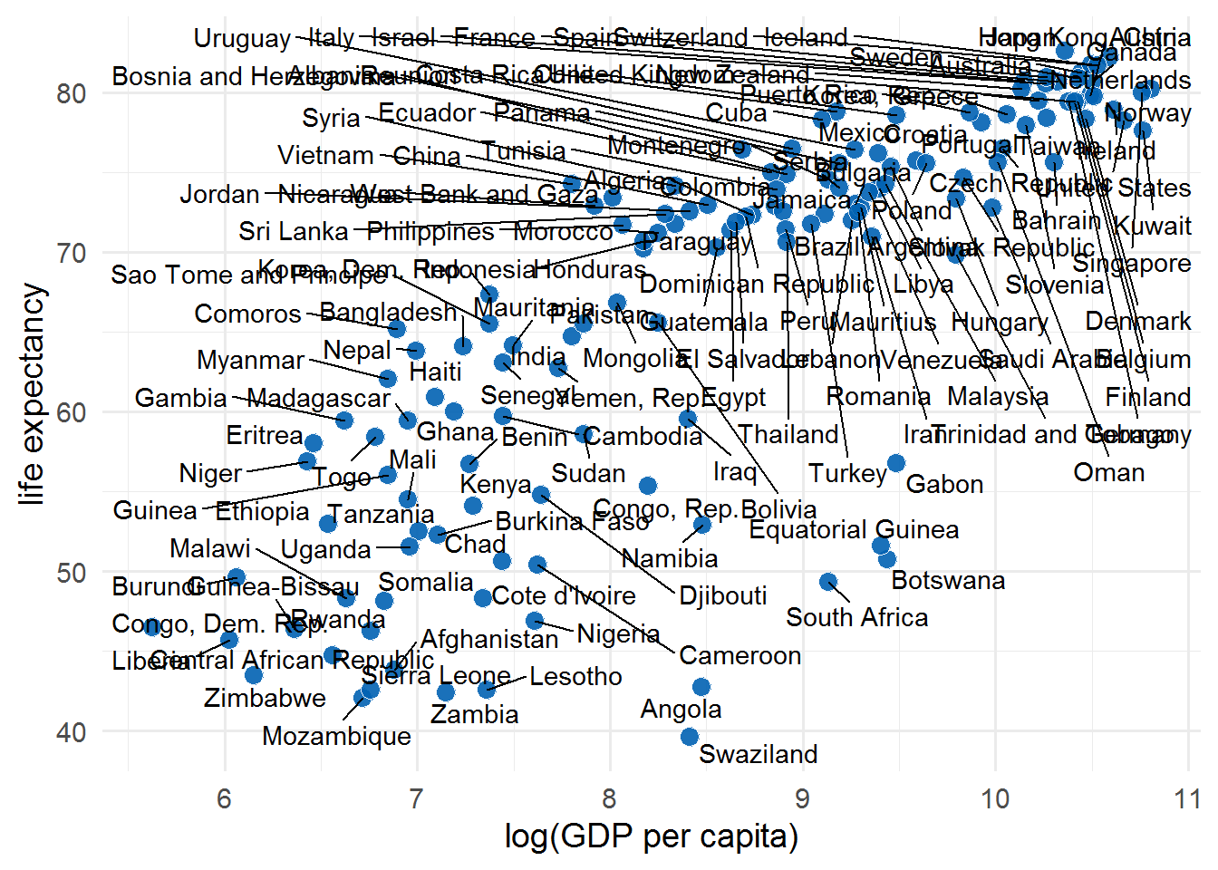
scatter_plot <- p1 +
    geom_text_repel(
        aes(label = label),
        size = 4.5,
        point.padding = .2,
        box.padding = .3,
        force = 1,
        min.segment.length = 0
    ) +
    theme_minimal(14) +
    theme(legend.position = "none",
          panel.grid.minor = element_blank()) +
    labs(x = "log(GDP per capita)",
         y = "life expectancy")
scatter_plot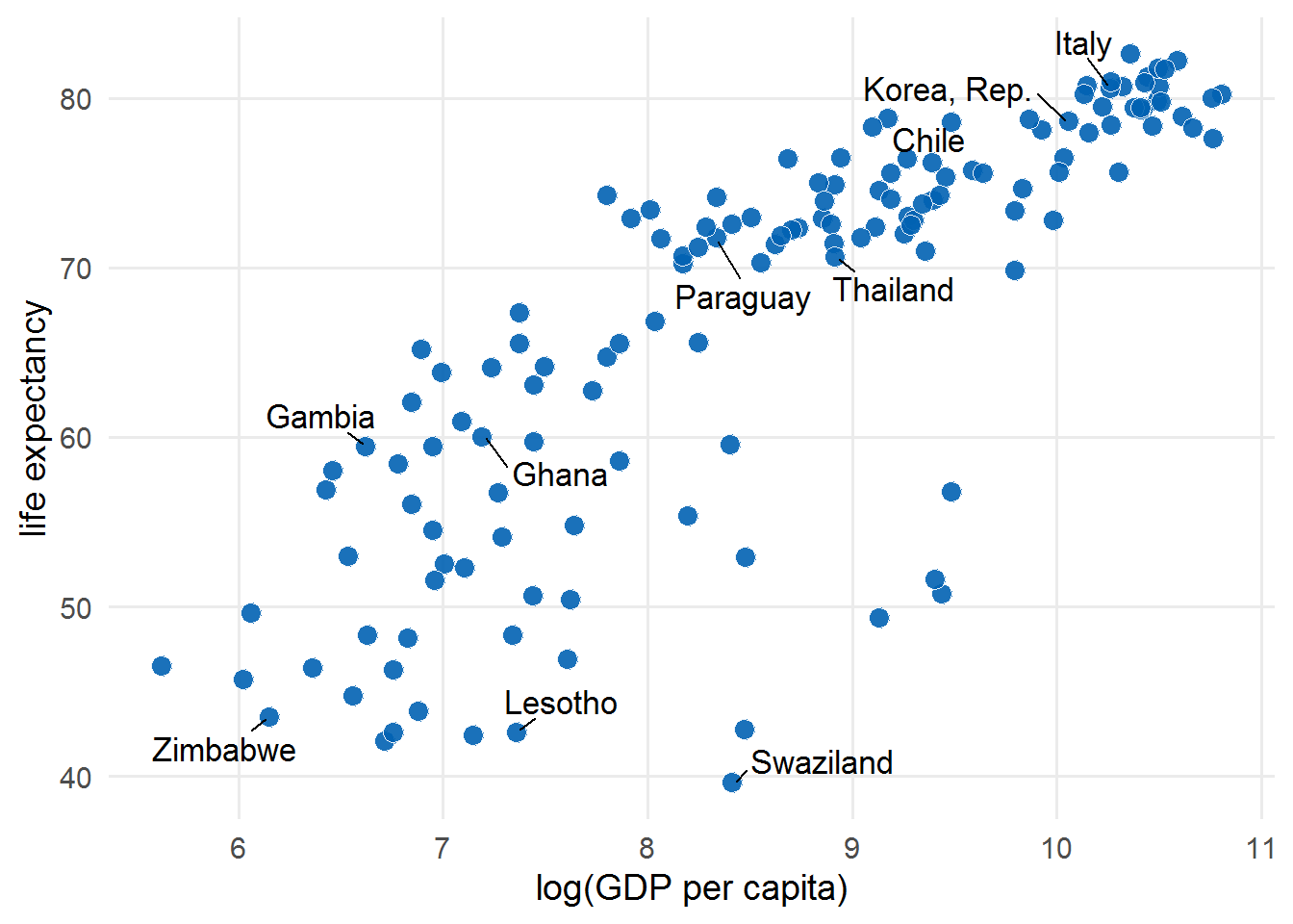
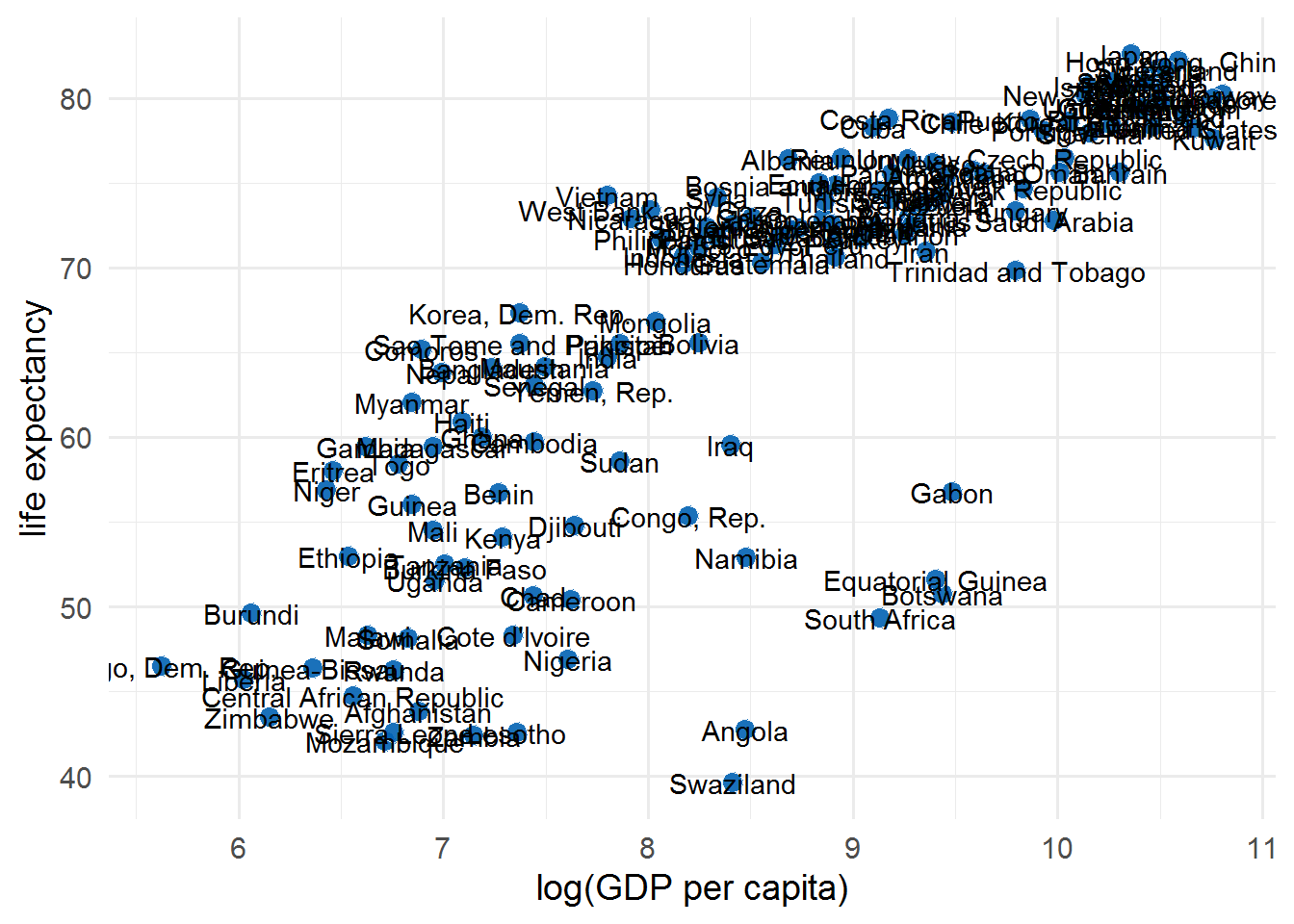
p1 +
    geom_text(
        data = function(x)
            filter(x, country == "Gabon"),
        # 这种匿名函数用法值得推崇
        aes(label = country),
        size = 4.5,
        hjust = 0,
        nudge_x = .06
    ) +
    theme_minimal(14) +
    theme(legend.position = "none",
          panel.grid.minor = element_blank()) +
    labs(x = "log(GDP per capita)",
         y = "life expectancy")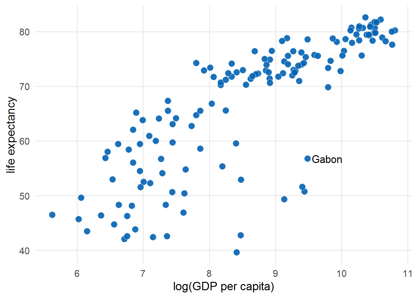
2 高亮关键信息
# 这个图有点问题
p <-
    emperors %>%
    count(cause) %>%
    ggplot(aes(y = n, x = cause)) +
    geom_col() +
    coord_flip() +
    # geom_text(
    #     aes(label = n, x = n - .25),
    #     color = "white",
    #     size = 5,
    #     hjust = 1
    # ) +
    geom_text(
        aes(label = n, y = n - .25),
        color = "white",
        size = 5,
        hjust = 1
    ) +
    cowplot::theme_minimal_vgrid(16) +
    theme(axis.title.y = element_blank(),
          legend.position = "none") +
    xlab("number of emperors")
emperors %>%
count(cause) %>%
arrange(n) %>%
mutate(cause = fct_inorder(cause)) %>% # 调整顺序
ggplot(aes(y = n, x = cause)) +
geom_col() +
coord_flip() +
geom_text(
aes(label = n, y = n - .25),
color = "white",
size = 5,
hjust = 1
) +
cowplot::theme_minimal_vgrid(16) +
theme(axis.title.y = element_blank(),
legend.position = "none") +
xlab("number of emperors")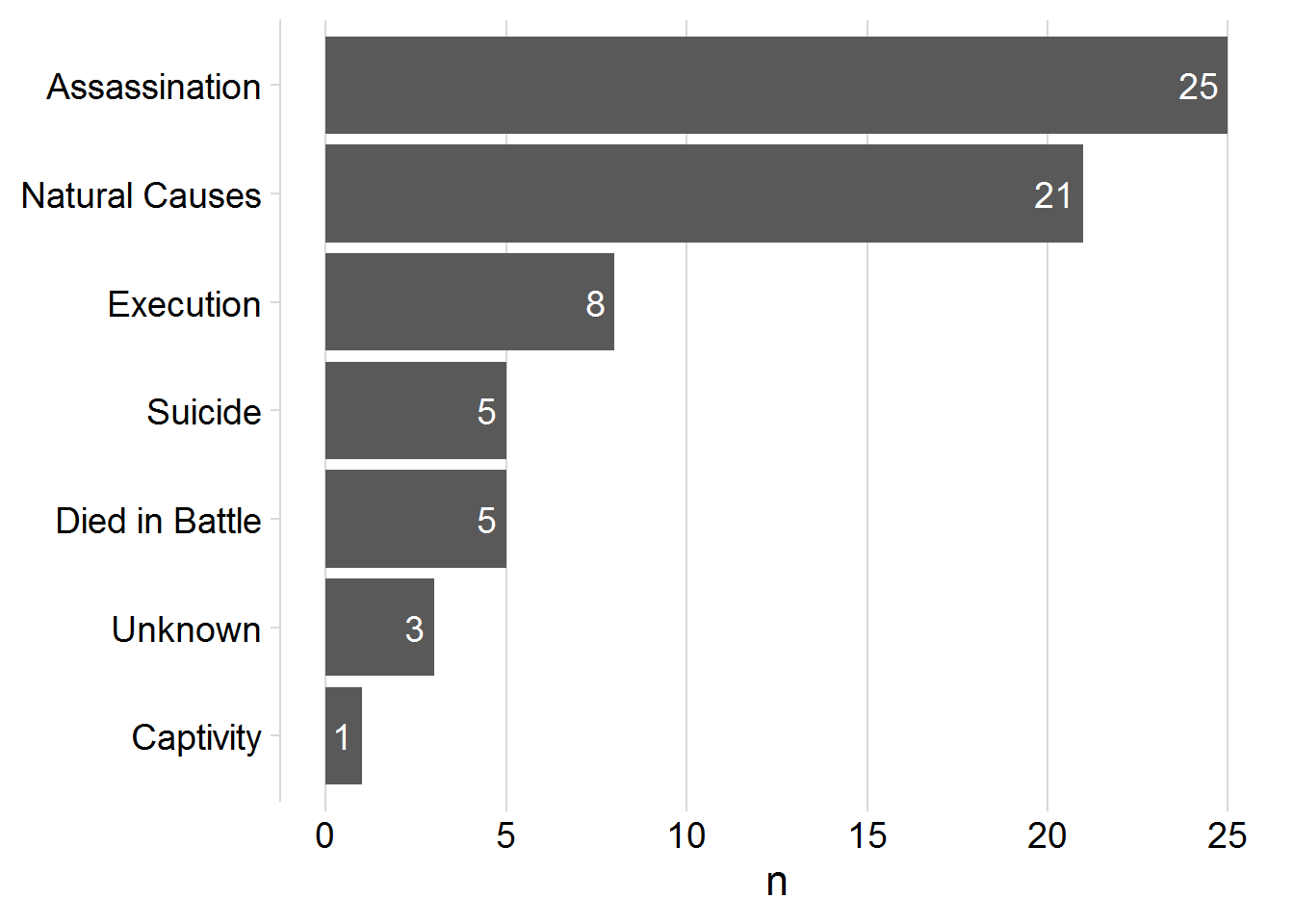
emperors_assassinated <- emperors %>%
    count(cause) %>%
    arrange(n) %>%
    mutate(
        assassinated = ifelse(cause == "Assassination", TRUE, FALSE),
        # 高亮某一个 col
        cause = fct_inorder(cause)
    )
emperors_assassinated %>%
    ggplot(aes(y = n, x = cause, fill = assassinated)) +
    geom_col() +
    coord_flip() +
    geom_text(
        aes(label = n, y = n - .25),
        color = "white",
        size = 5,
        hjust = 1
    ) +
    cowplot::theme_minimal_vgrid(16) +
    theme(axis.title.y = element_blank(),
          legend.position = "none") +
    scale_fill_manual(name = NULL,
                      values = c("#B0B0B0D0", "#D55E00D0")) +
    xlab("number of emperors")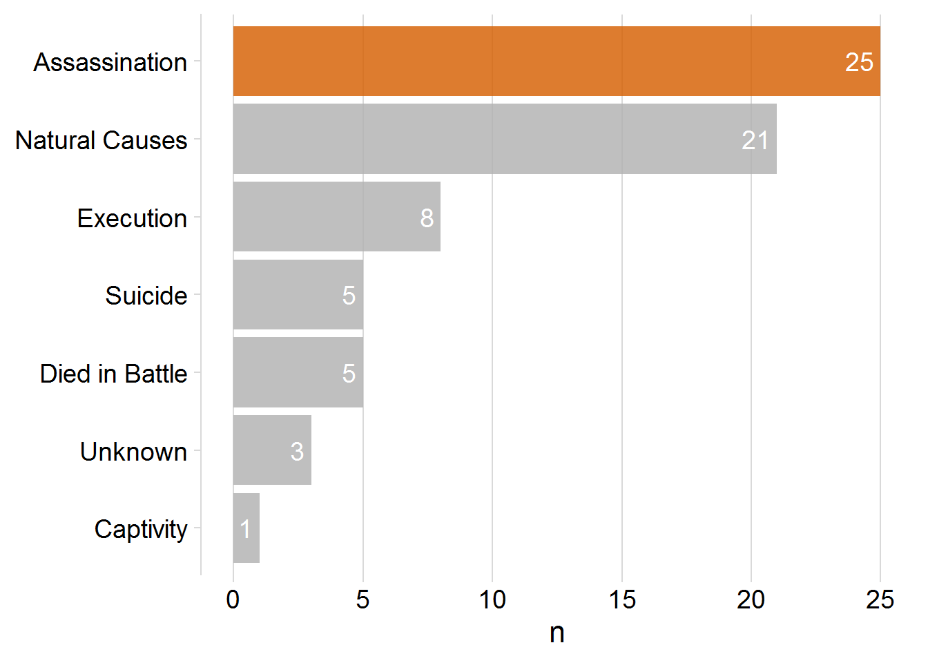
diabetes <- read_csv("../data/diabetes.csv")
density_colors <- c("grey", "red", "blue")
diabetes_plot <-
diabetes %>%
    drop_na(glyhb, gender) %>%
    ggplot(aes(glyhb, y = ..count..)) +
    geom_density(
        data = function(x)
            select(x,-gender),
        # 调用隐藏函数
        # 绘画整体
        aes(fill = "all participants", color = "all participants")
    ) +
    geom_density(aes(fill = gender, color = gender)) +
    facet_wrap(vars(gender)) +
    scale_x_log10(name = "glycosylated hemoglobin a1c") +
    scale_color_manual(name = NULL, values = density_colors) +
    scale_fill_manual(name = NULL, values = density_colors) +
    theme_minimal_hgrid(16) +
    theme(legend.position = "bottom", legend.justification = "center")
diabetes_plot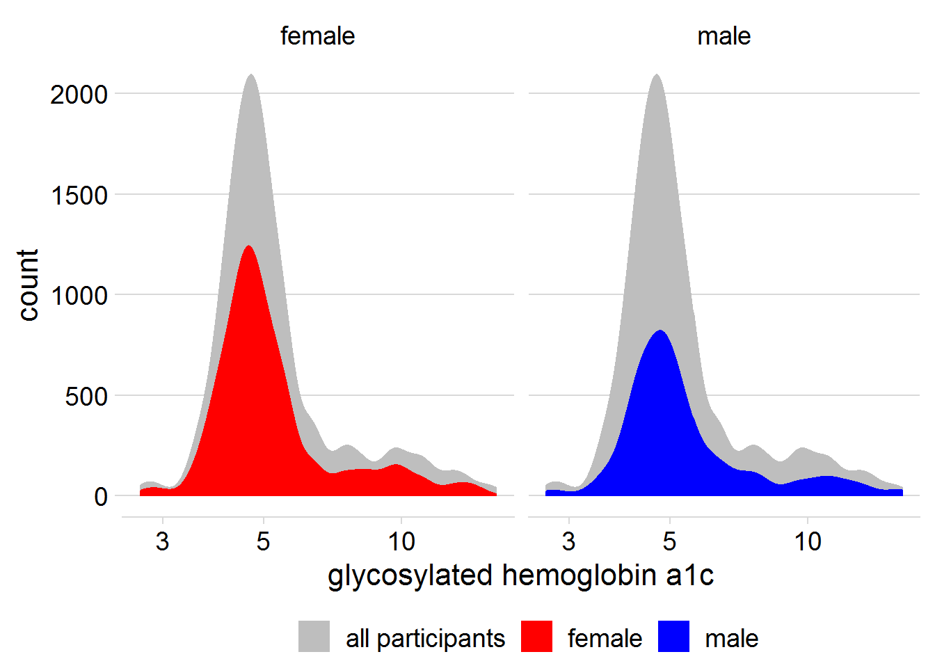
2.1 箭头指明
emperors_assassinated <- emperors %>%
    count(cause) %>%
    arrange(n) %>%
    mutate(
        assassinated = ifelse(cause == "Assassination", TRUE, FALSE),
        # 高亮某一个 col
        cause = fct_inorder(cause)
    )
lightning_plot <-
    emperors_assassinated %>%
    ggplot(aes(y = n, x = cause, fill = assassinated)) +
    geom_col() +
    coord_flip() +
    geom_text(
        aes(label = n, y = n - .25),
        color = "white",
        size = 5,
        hjust = 1
    ) +
    cowplot::theme_minimal_vgrid(16) +
    theme(axis.title.y = element_blank(),
          legend.position = "none") +
    scale_fill_manual(name = NULL,
                      values = c("#B0B0B0D0", "#D55E00D0")) +
    xlab("number of emperors")
label <- "Carus, Roman emperor from 282–283,
allegedly died of a lightning strike while
campaigning against the Empire of Iranians.
He was succeded by his sons, Carinus, who
died in battle, and Numerian, whose cause
of death is unknown."
# 自动空行
lightning_plot2 <-
lightning_plot +
geom_label(
data = data.frame(x = 3, y = 10, label = label),
aes(x = x, y = y, label = label),
hjust = 0,
lineheight = .8,
inherit.aes = FALSE,
label.size = NA
) +
geom_curve(
data = data.frame(
x = 3-0.2,
y = 10,
xend = 1.2,
yend = 5
),
mapping = aes(
x = x,
y = y,
xend = xend,
yend = yend
),
colour = "grey75",
size = 0.5,
curvature = -0.1,
# 曲线弧度不太太强
arrow = arrow(length = unit(0.01, "npc"), type = "closed"),
inherit.aes = FALSE
)
lightning_plot2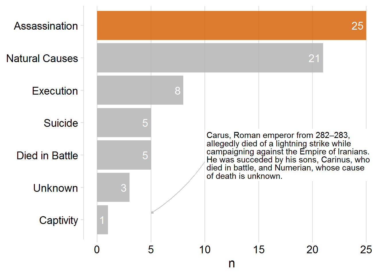
2.2 使用 ggannotate 进行标注
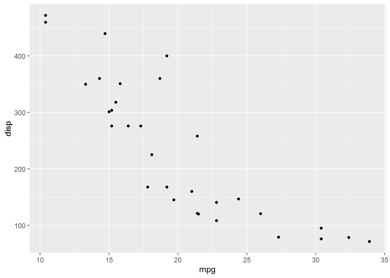
# remotes::install_github("mattcowgill/ggannotate")
library(tidyverse)
ggannotate::ggannotate(p1 <-
    mtcars %>%
    ggplot() +
    aes(disp, mpg) +
    geom_point()
)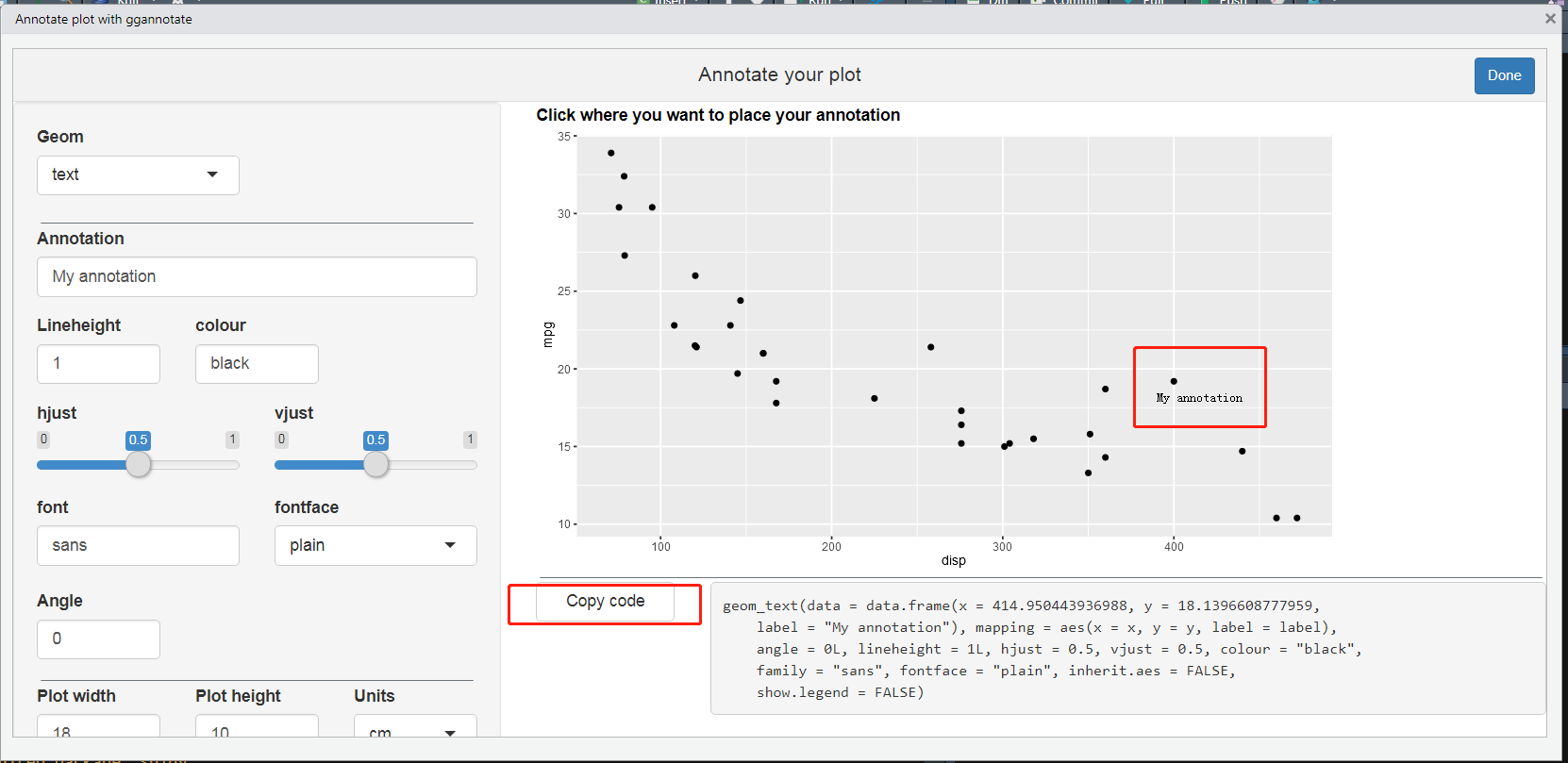
2.3 直接命名
library(cowplot)
library(gapminder)
library(tidyverse)
continent_data <- gapminder %>%
    group_by(continent, year) %>%
    summarise(lifeExp = mean(lifeExp))
direct_labels <- continent_data %>%
    group_by(continent) %>%
    summarize(y = max(lifeExp))
line_plot <- continent_data %>%
    ggplot(aes(year, lifeExp, col = continent)) +
    geom_line(size = 1) +
    theme_minimal_hgrid() +
    theme(legend.position = "none") +
    scale_color_manual(values = continent_colors) +
    # scale_x_continuous(expand = expansion()) +
    labs(y = "life expectancy")
direct_labels_axis <- line_plot %>%
    axis_canvas(, axis = "y") +
    geom_text(
        data = direct_labels,
        aes(y = y, label = continent),
        x = .05,
        size = 4.5,
        hjust = 0
    )
p_direct_labels <- insert_yaxis_grob(line_plot, direct_labels_axis)
ggdraw(p_direct_labels)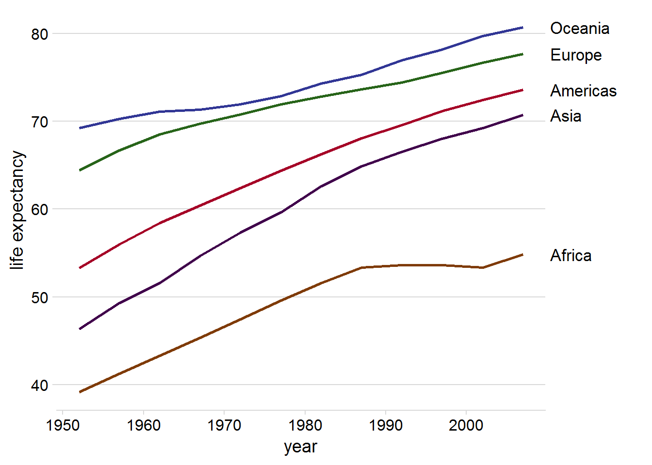
line_plot +
    geom_text(
        data = direct_labels %>% mutate(year = 2000),
        aes( y = y, label = continent),
        size = 4.5,
        hjust = 0,
        nudge_x = 8,
        fontface  = "bold"
    ) +
    geom_text(aes(label = scales::comma(lifeExp)),
              nudge_y = 2,
              check_overlap  = TRUE) +
    xlim(1950, 2014)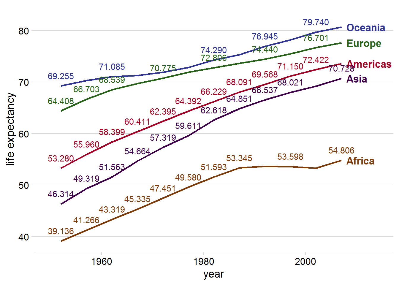
direct labeling 加粗,这样线上的 text 就区分大点。
参考 https://drsimonj.svbtle.com/label-line-ends-in-time-series-with-ggplot2
continent_data %>%
    ggplot(aes(year, lifeExp, col = continent)) +
    geom_line(size = 1) +
    theme_minimal_hgrid() +
    theme(legend.position = "none") +
    scale_color_manual(values = continent_colors) +
    # scale_x_continuous(expand = expansion()) +
    labs(y = "life expectancy") +
    scale_y_continuous(sec.axis = sec_axis(~ ., breaks = direct_labels$y, labels = direct_labels$continent))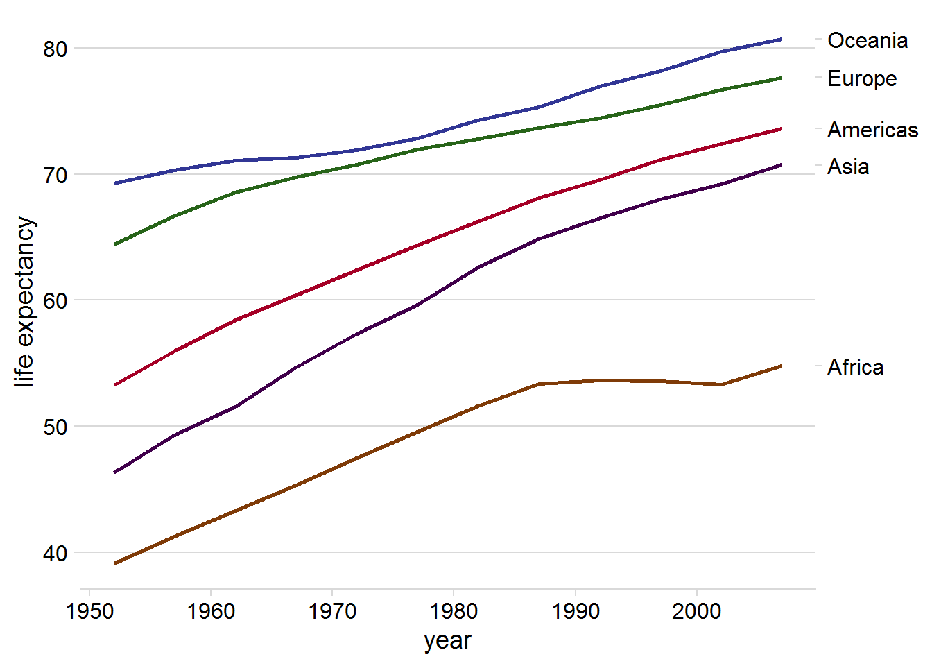
3 串联
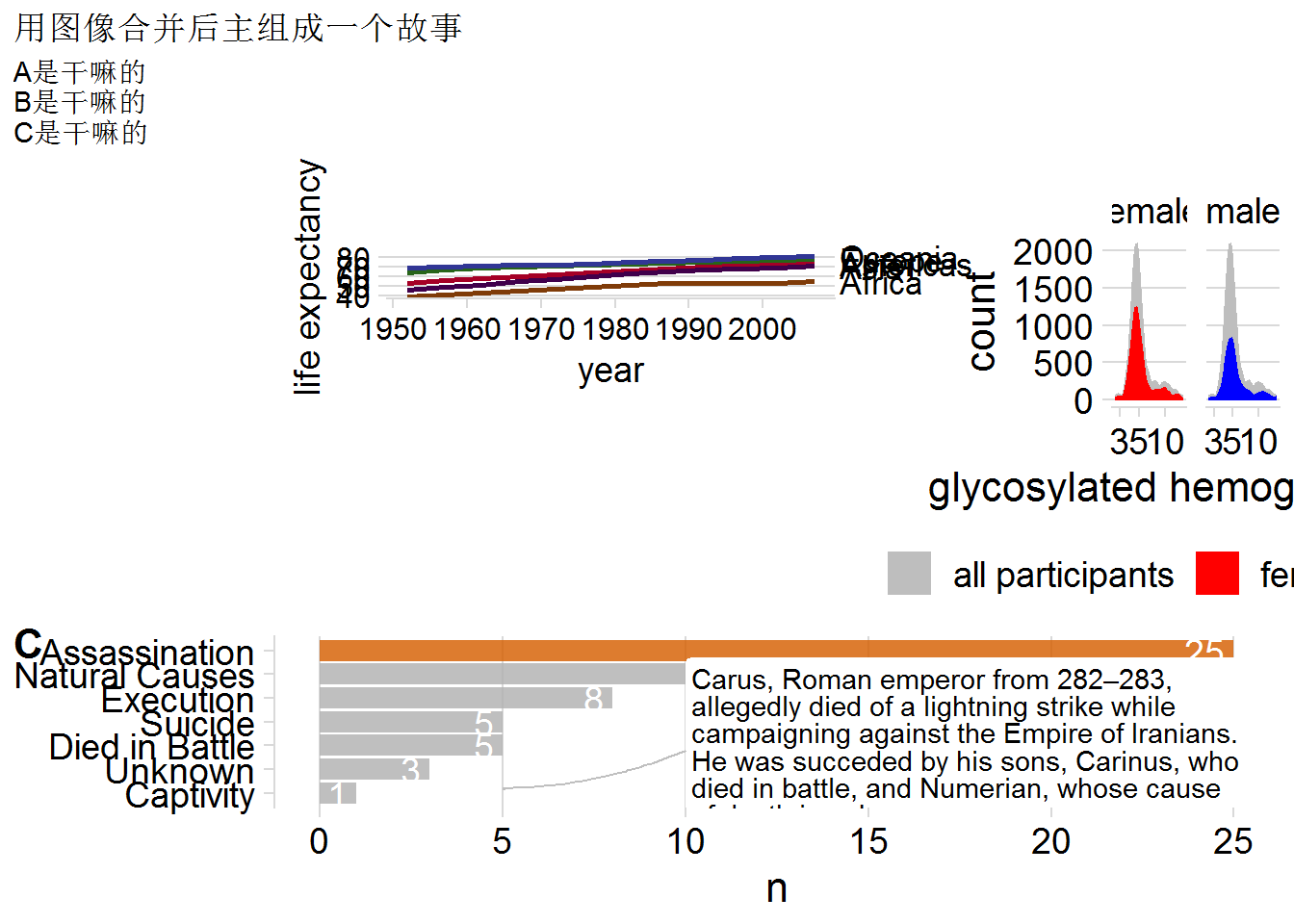
p1 <- read_rds("../output/lightning_plot2.rds")
p2 <- read_rds("../output/p_direct_labels.rds")
p3 <- read_rds("../output/diabetes_plot.rds")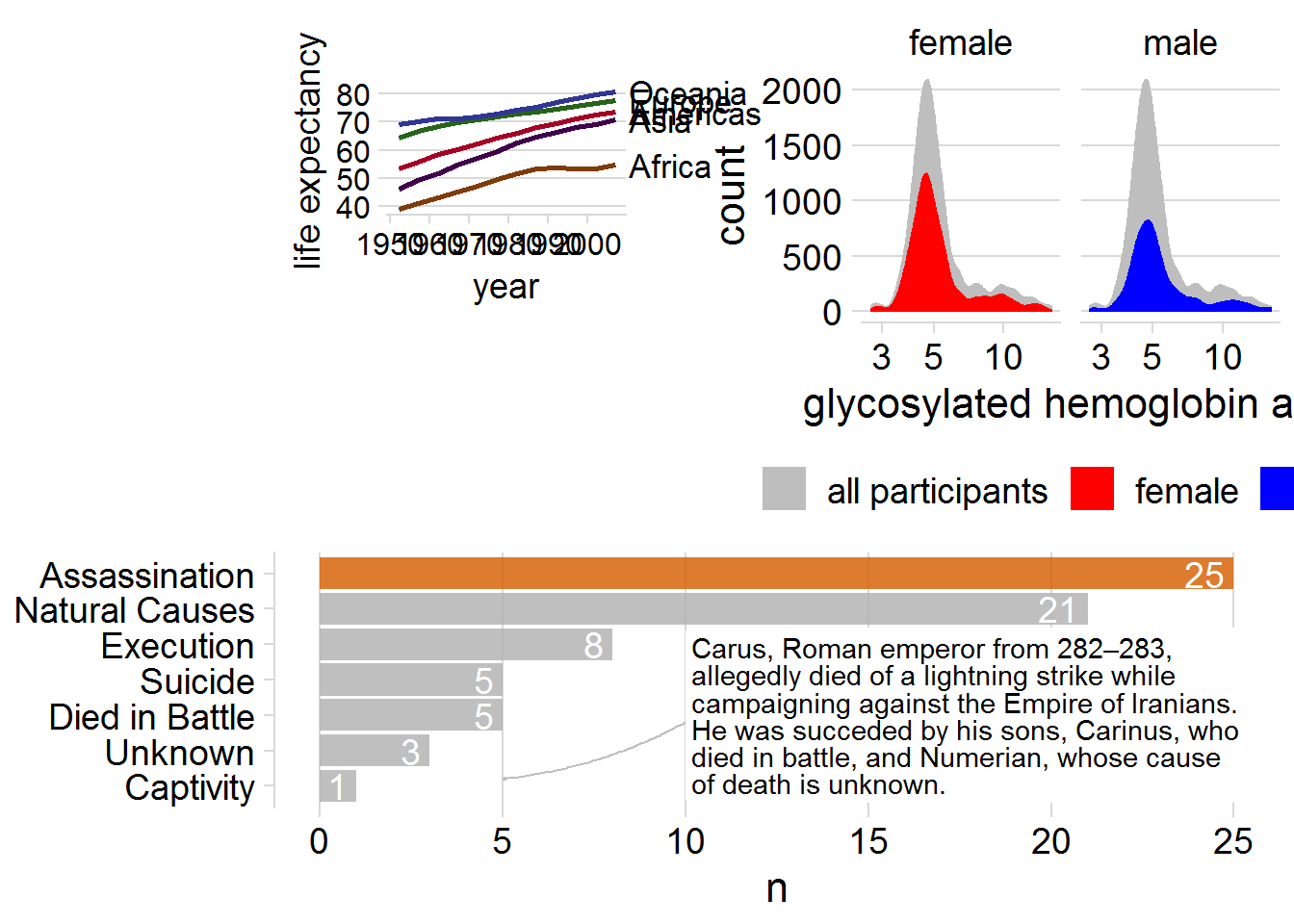
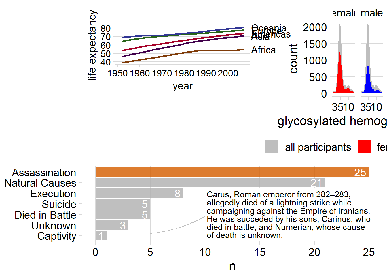
(p2 + labs(tag = "A(1)") +
     p3 + labs(tag = "A(2)") +
plot_layout(widths = c(4, 1))) / p1 +
plot_annotation(
tag_levels = "A",
title = '用图像合并后主组成一个故事',
subtitle = "A是干嘛的\nB是干嘛的\nC是干嘛的"
)
4 配色方案
4.1 查询 RGB
如何知道一个颜色的色号?一般如#063376定义。
一般的截图软件(如微信、QQ)都可以查询到 RGB,然后使用R的函数
## [1] "#010101"就能知道了。
4.2 寻找马尔斯绿
目前回答了这个 知乎问题。 从抖音的一个短视频了解到这个颜色。 参考维基百科
- 马尔斯绿
- Marrs Green
"#008C8C"
library(ggplot2)
plot_color <- function(color_code = "#008C8C"){
    color_filled <- element_rect(fill = color_code)
    ggplot() +
        theme(
            plot.background = color_filled,
            panel.background = color_filled
        )
}
但是为了求证,我找了下相关原图进行验证,发现并不是,因此实践中,用这个颜色可能需要注意下。
参考维基百科中两篇介绍的报道中的图片。
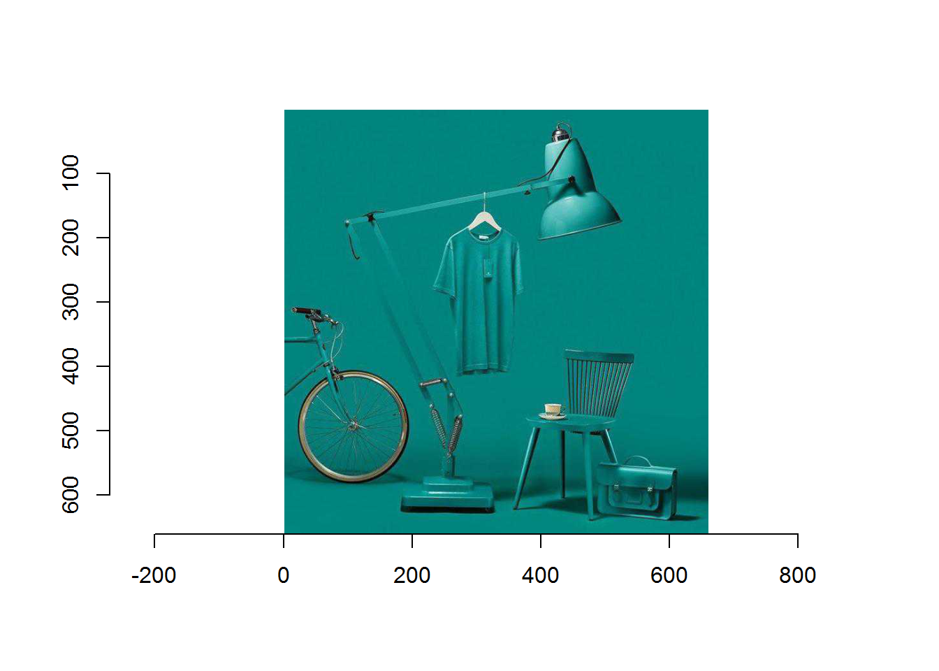
- 感觉图像颜色有点不对,好好研究 Imperfect 的函数。
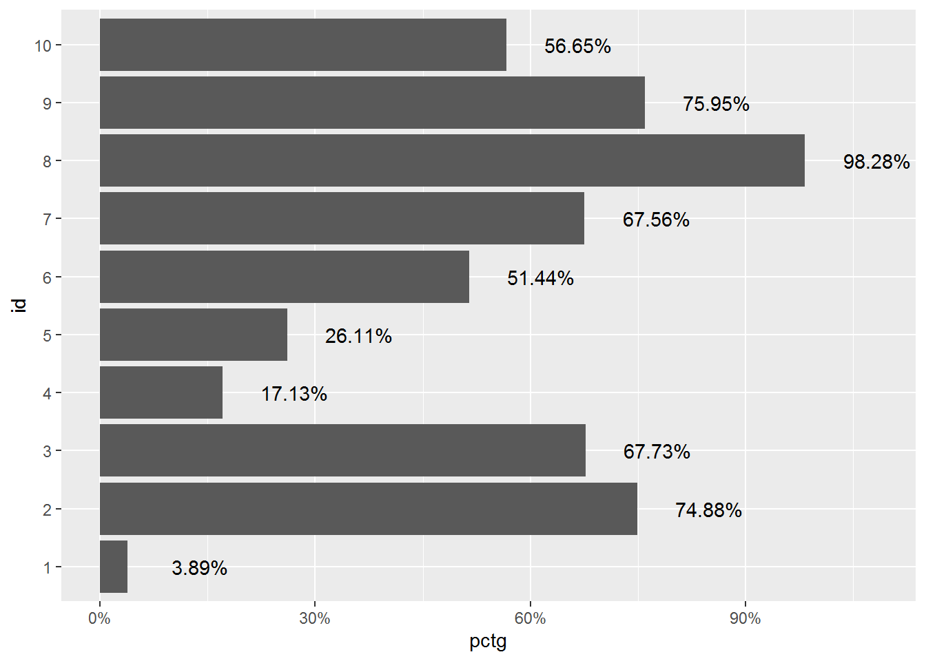
5 y axis by scales
p1 <-
  data.frame(pctg = runif(10, 0, 1)) %>%
  mutate(id = row_number() %>% as.factor()) %>%
  ggplot(aes(x = id, y = pctg)) +
  geom_col() +
  coord_flip() +
  scale_y_continuous(labels = scales::percent)
p1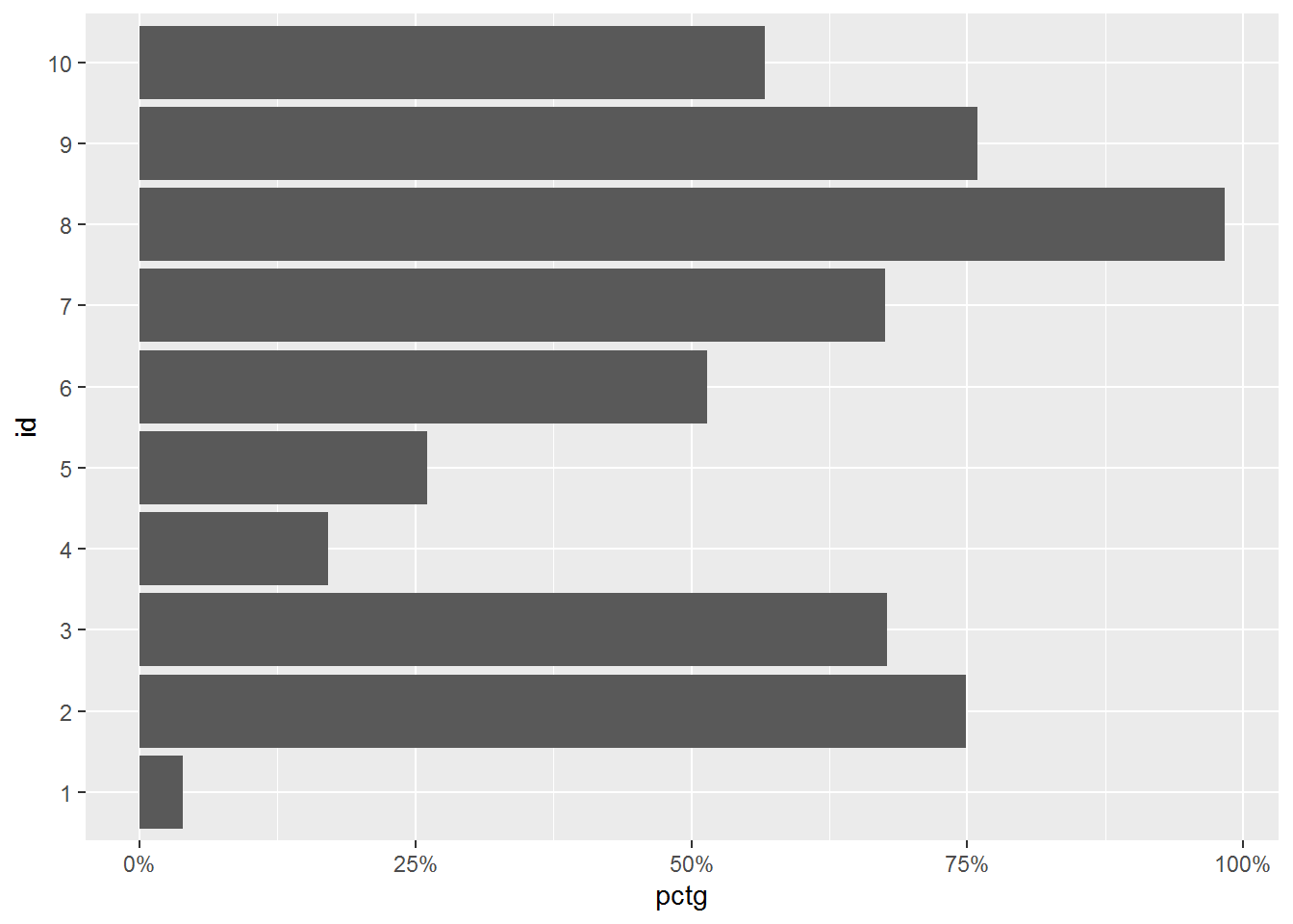
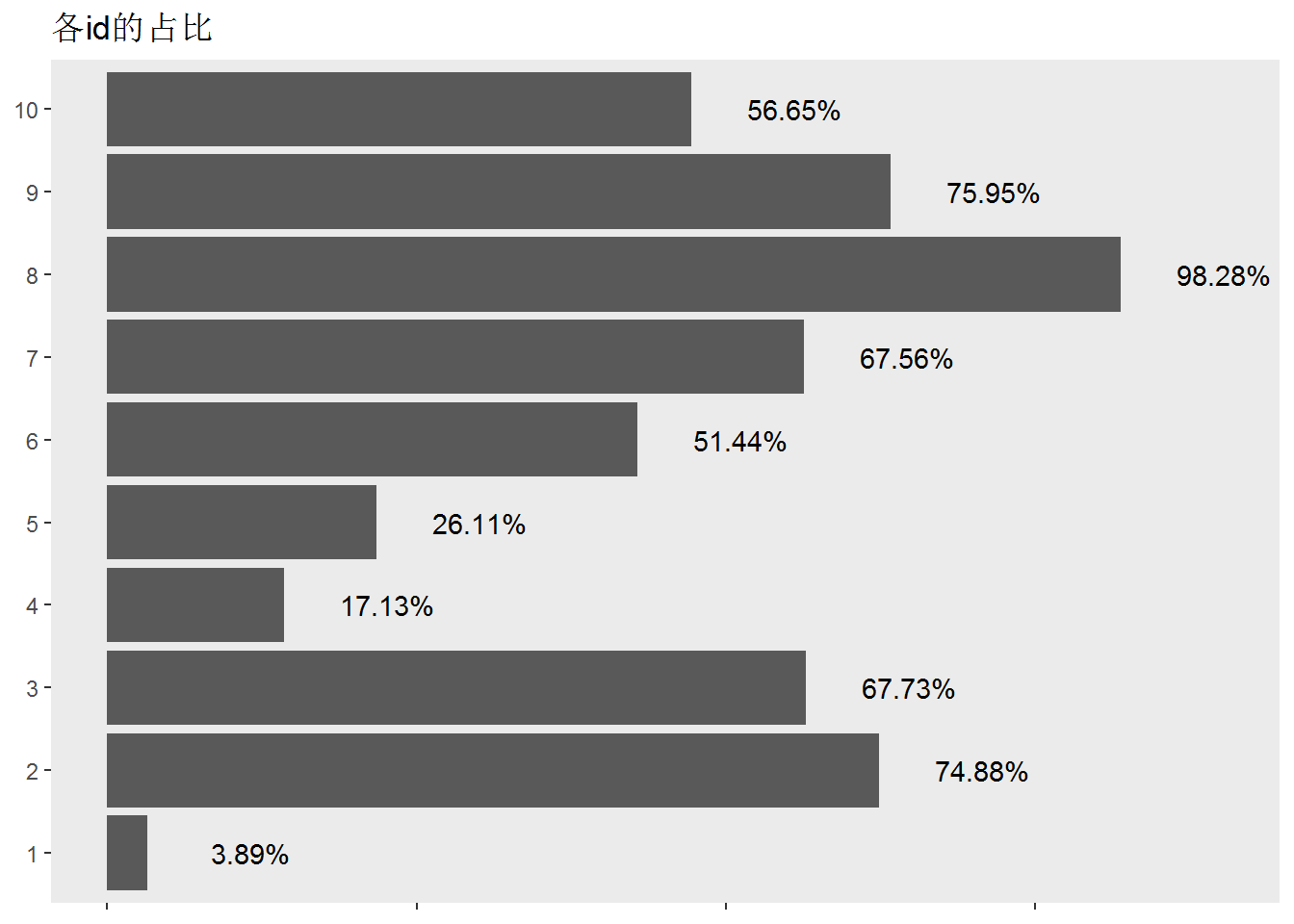
7 tidy up
比如显而易见的 axis title 就可以删除,标注了数据就可以删除网格线。
p2 +
  theme(
    axis.title = element_blank(),
    panel.grid = element_blank(), # 失去网格
    axis.text.x = element_blank() # 都有百分比了,x轴去掉
  ) +
  labs(
    title = "各id的占比"
  )
8 scales
参考 Seidel (2020a),Seidel (2020b),Seidel (2020c)
8.1 custom transformations
尝试自己改变横纵轴 label
# use trans_new to build a new transformation
cny_log <- trans_new(
  name = "cny_log",
  # extract a single element from another trans
  trans = log10_trans()$trans,
  # or write your own custom functions
  inverse = function(x) 10^(x),
  breaks = breaks_log(),
  format = label_dollar(prefix = "CNY")
)## scale_x_continuous(trans = cny_log)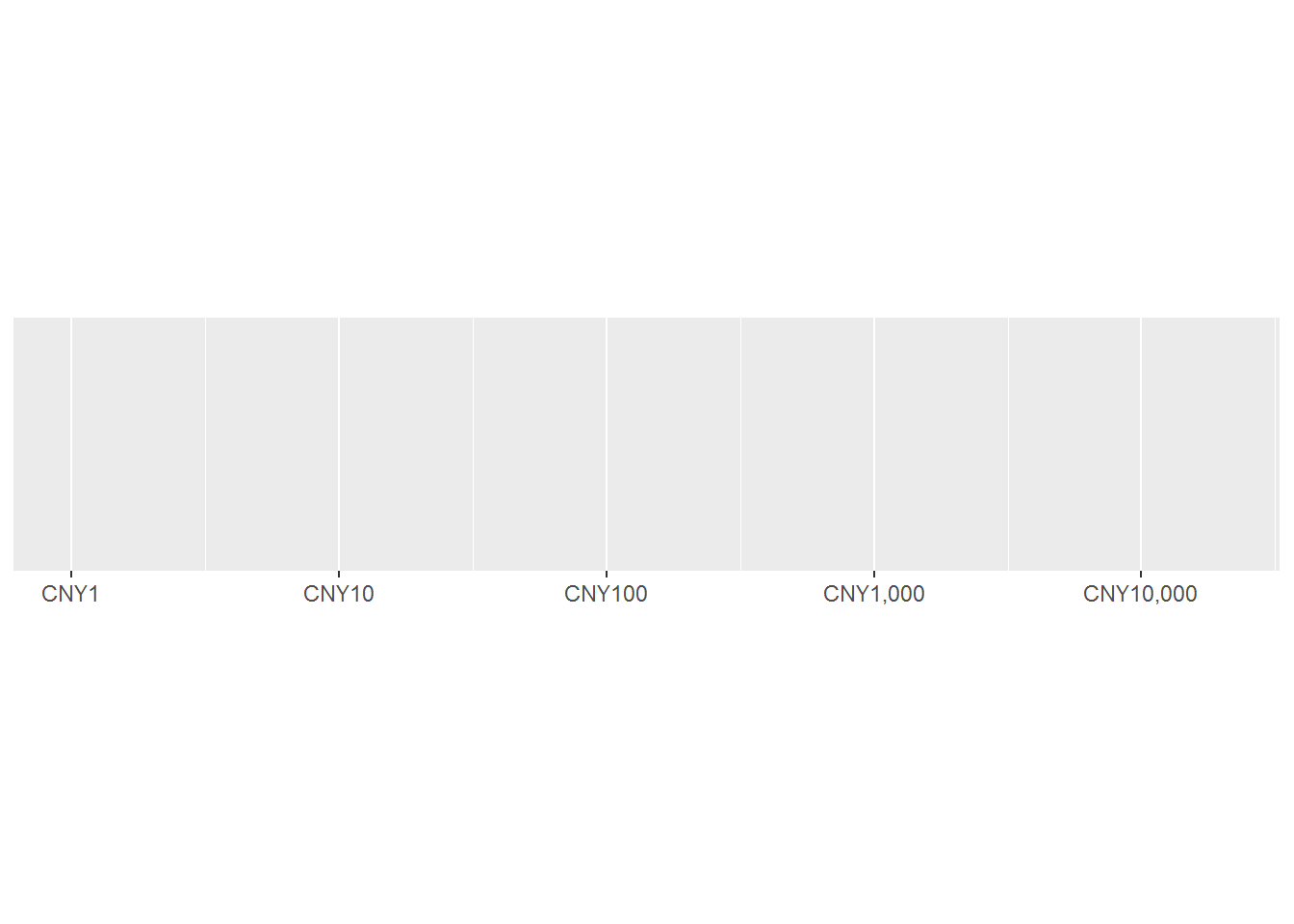
Figure 8.1: trans_new生成的新 transformation,具备刻度尺(trans)、切分点(breaks)、命名(format)一体修改,方便简单调用。
ggplot(diamonds, aes(y = price, x = carat)) +
  geom_hex() +
  scale_y_continuous(trans = cny_log) +
  scale_x_log10()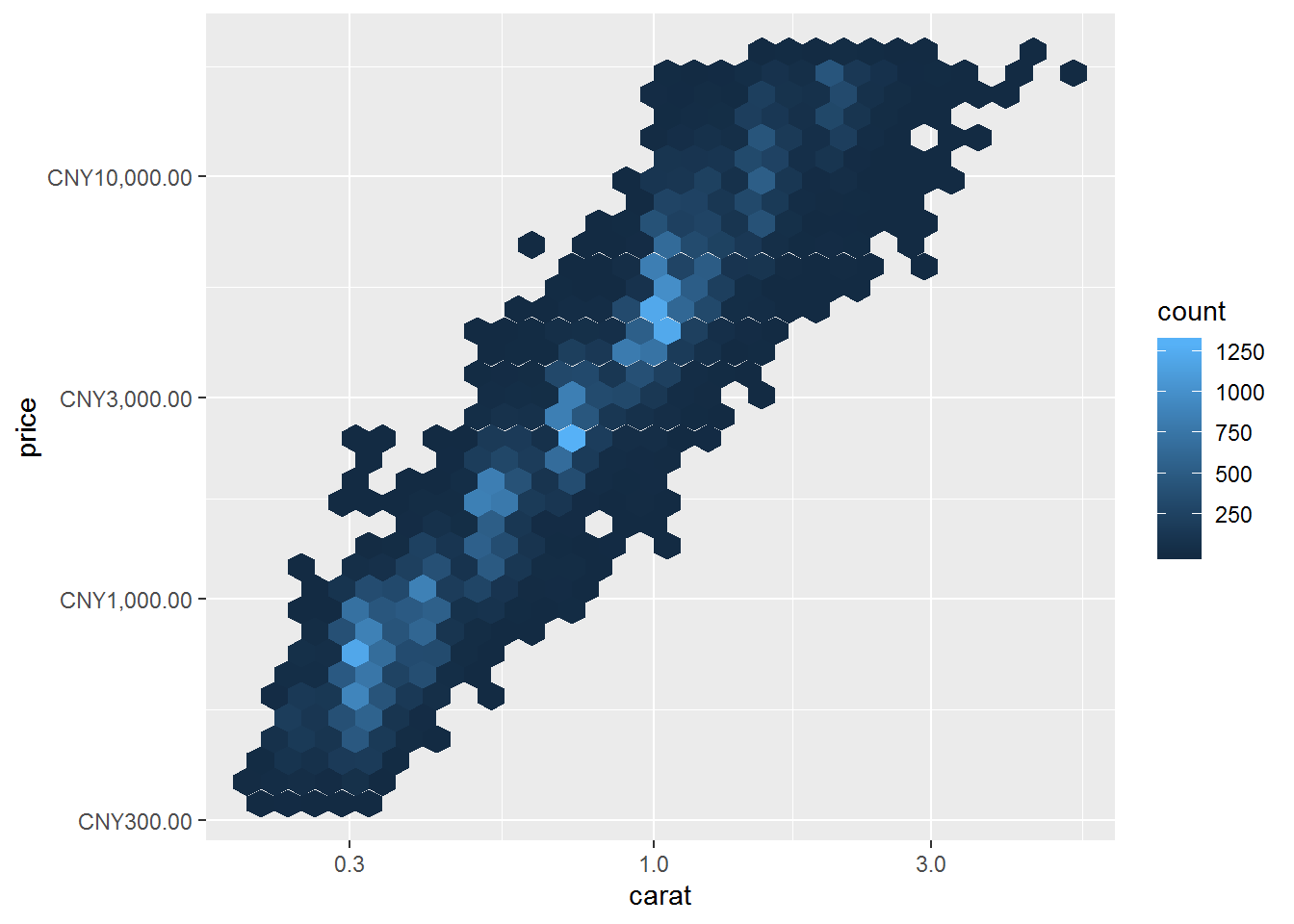
8.2 Rescale data
rescalerescales to a new min and maxrescale_midrescales to a new mid, max, and minrescale_maxrescales to a new maximum
set.seed(123)
rand_list <- runif(100)
rand_list %>% data.frame(x = .) %>% ggplot(aes(x = x)) + geom_density()
rescale(rand_list, to = c(0, 50)) %>% data.frame(x = .) %>% ggplot(aes(x = x)) + geom_density()
rescale_mid(rand_list, to = c(0, 50), mid = 1) %>% data.frame(x = .) %>% ggplot(aes(x = x)) + geom_density()
# rescale_max(runif(5))
# 还不会使用。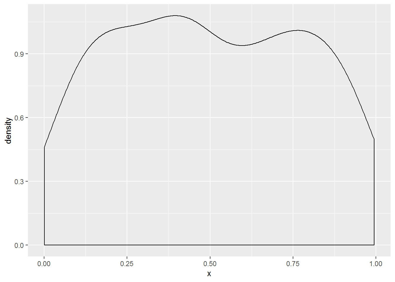
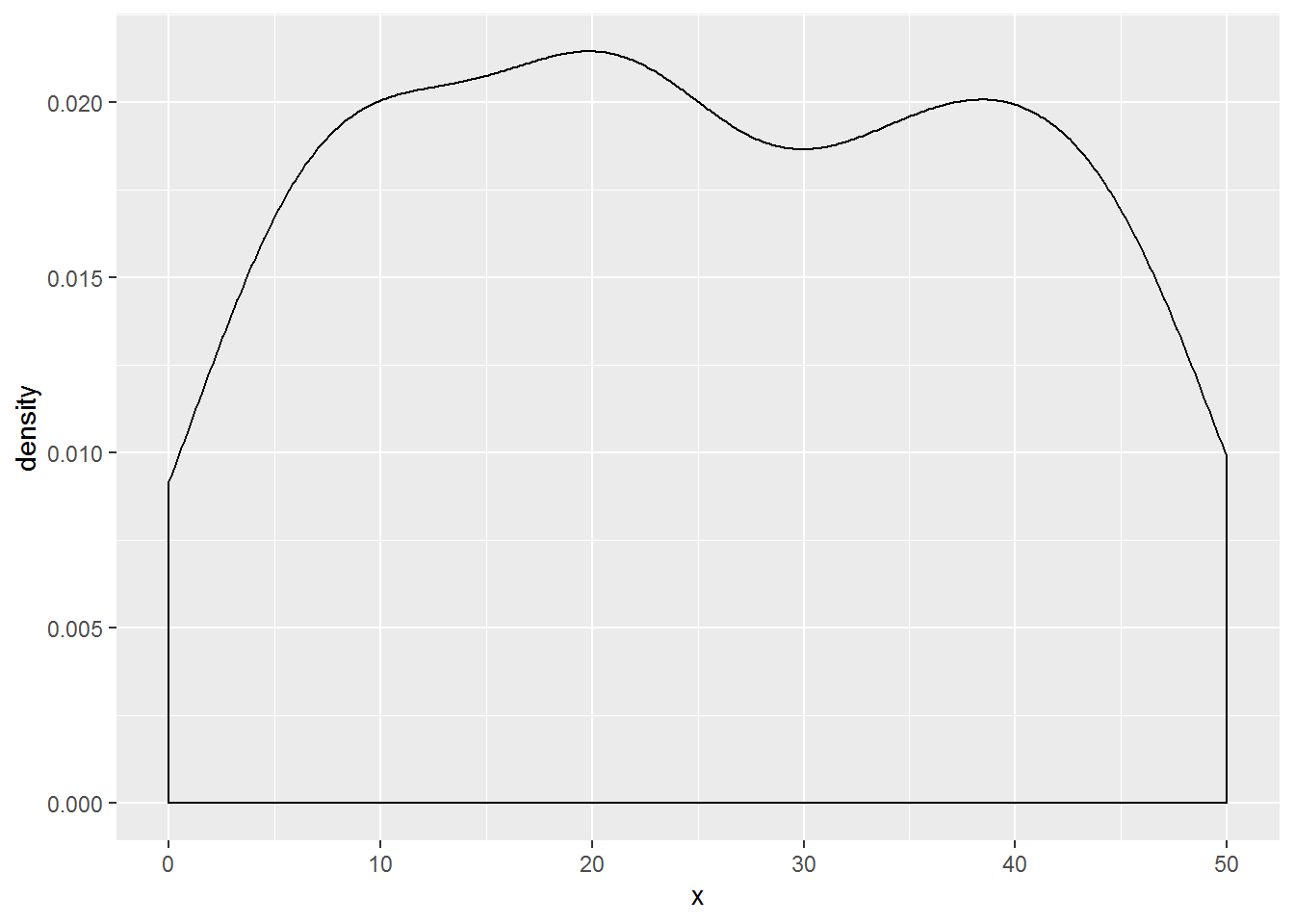
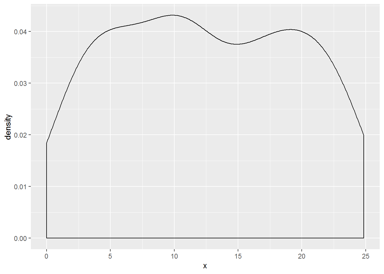
Figure 8.2: rescale 后,做数据的标准化,而且改变中位数,但是不改变分布。
8.3 处理异常值
squishwill squish your values into a specified range, respecting NAsdiscardwill drop data outside a range, respecting NAscensorwill return NAs for values outside a range
## [1] 0.0 0.5 1.0 1.0 NA## [1] 0.5 1.0 NA## [1] NA 0.5 1.0 NA NA8.4 break
比cut好很多。
breaks_extended()sets most breaks by default in ggplot2 using Wilkonson’s algorithmbreaks_pretty()uses R’s default breaks algorithmbreaks_log()is used to set breaks for log transformed axes withlog_trans().breaks_width()is used to set breaks by width, especially useful for date and date/time axes.
## [1] 0 100 200 300 400 500 600 700 800 900 1000## [1] 70 100 200 300 400 500 700 1000## [1] 0 8 16 24 32 40 48 56 64 72 80 88 96 104 1128.5 Label Formatters
label_number: a generic number formatter that forces intuitive decimal display of numberslabel_dollar,label_percent,label_commalabel_scientificlabel_date,label_time: Formatted dates and times.label_ordinal: add ordinal suffixes (-st, -nd, -rd, -th) to numbers according to languages (e.g. English, Spanish, French).label_bytes,label_number_silabel_parse,label_math,label_pvalue还有 pvalue 进行展示label_wrap
8.6 demo
## scale_x_continuous(labels = label_dollar(prefix = "CNY"))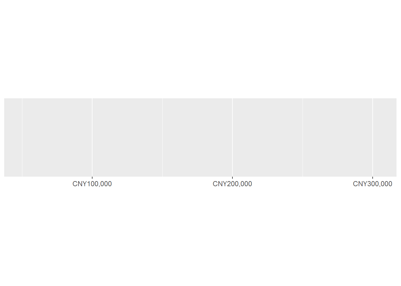
这样可以七天设置的周期。
都是副词语法。
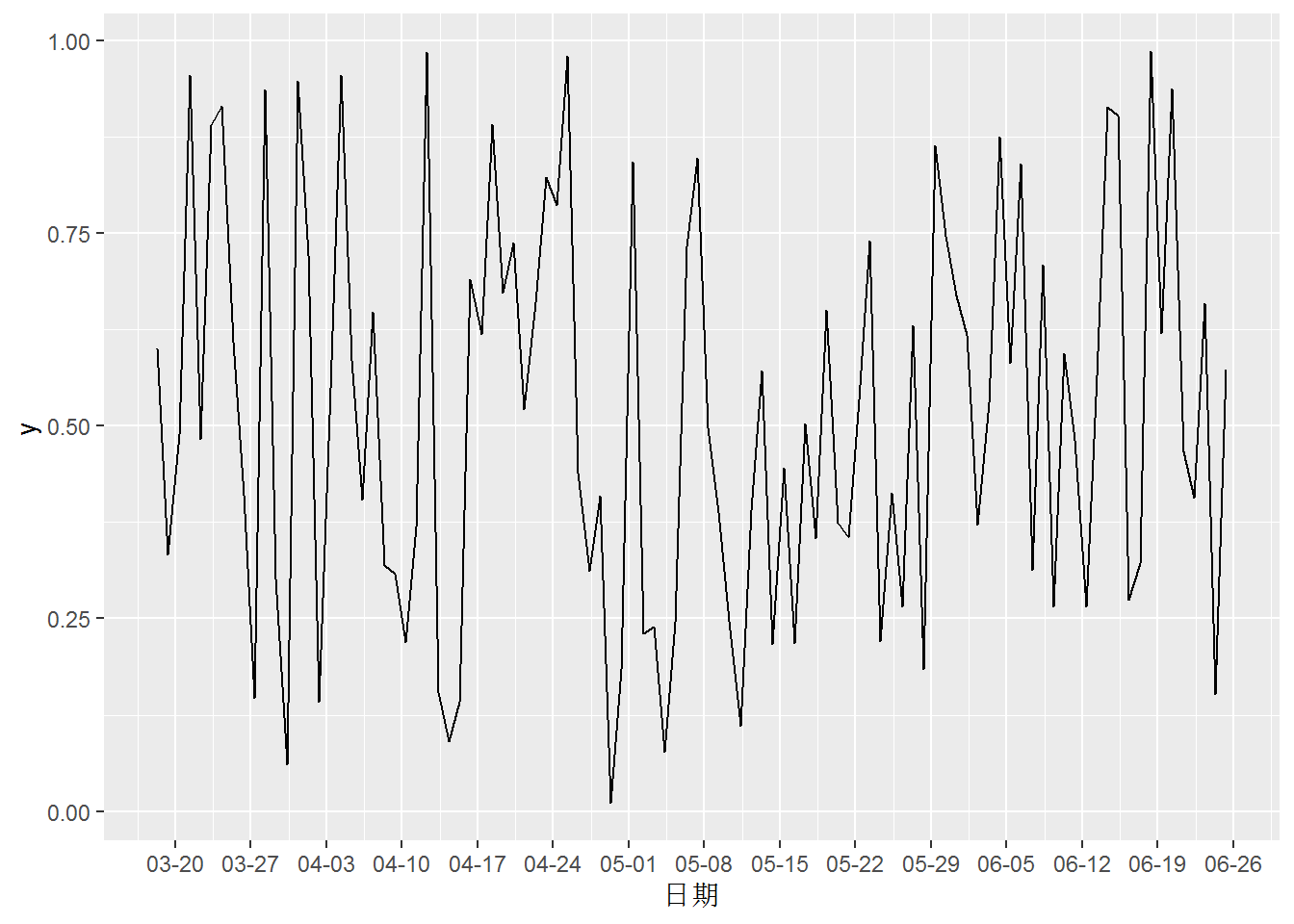
demo_datetime(as.POSIXct(lubridate::today() + ddays(1:100)), breaks = breaks_width("7 day")) +
    coord_flip()
## scale_x_datetime(breaks = breaks_width("7 day"))
## [1] "03-18"data.frame(
date = as.POSIXct(lubridate::today() + ddays(1:100)),
y = runif(100)
) %>%
ggplot(aes(date,y)) +
geom_line() +
scale_x_datetime("日期",
breaks = breaks_width("7 days"),
labels = label_date("%m-%d")
)
8.7 palettes
副词语法
可以在 base 图上进行修改。
附录
参考文献
Barrett, Malcolm. 2019. “Designing Ggplots: Making Clear Figures That Communicate.” GitHub. 2019. https://github.com/malcolmbarrett/designing.ggplots.
Seidel, Dana. 2020a. “The Little Package That Could: Taking Visualizations to the Next Level with the Scales Package.” RStudio Conference 2020. 2020. https://resources.rstudio.com/rstudio-conf-2020/the-little-package-that-could-taking-visualizations-to-the-next-level-with-the-scales-package-dana-seidel.
———. 2020b. “The Little Package That Could: Taking Visualizations to the Next Level with the Scales Package.” RStudio Conference 2020. 2020. https://www.danaseidel.com/rstudioconf2020.
———. 2020c. “The Little Package That Could: Taking Visualizations to the Next Level with the Scales Package.” RStudio Conference 2020. 2020. https://github.com/dpseidel/rstudioconf2020.