r_eda
Stack 直方图,使用 ggplot2 参数美化
Jiaxiang Li 2019-03-12
参考 github
knitr::opts_chunk$set(warning = FALSE, message = FALSE)
suppressMessages(library(tidyverse))
source("theme_du_bois.R")
font_name <- "Inconsolata"
gender <- c("female", "male")
status <- c("single", "widowed", "married")
age_bins <- c(
"0-15", "15-20", "20-25", "25-30", "30-35",
"35-45", "45-55", "55-65", "OVER 65"
)
marital <- expand.grid(age_bins, gender, status)
names(marital) <- c("age", "gender", "status")
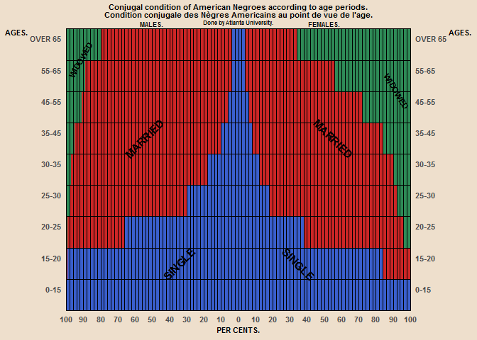
# eyeballing values from original graph:
# single women/men, widowed women/men, married women/men
marital$pct <- c(
100, 84, 38, 18, 12, 8, 6, 4, 4,
100, 99, 66, 30, 18, 10, 6, 4, 4,
0, 0, 4, 8, 10, 16, 28, 44, 66,
0, 0, 1, 2, 3, 5, 9, 11, 20,
0, 16, 58, 74, 78, 76, 66, 52, 30,
0, 1, 33, 68, 79, 85, 85, 85, 76
)
marital$status <- factor(
marital$status,
levels = c("widowed", "married", "single")
)
# want the age groups to be numeric so that i can use scale_x_continuous to
# duplicate this axis
marital$age_numeric <- as.numeric(marital$age)
ppmsca_33915 <- ggplot(
  data = marital,
  mapping = aes(
    x = age_numeric,
    # should just be able to negate pct to get pyramid plot. for gender, men
    # are on the left, so they get the negative
    y = ifelse(gender == "male", -pct, pct),
    fill = status
  )
) +
  geom_bar(
    stat = "identity",
    width = 1
  ) +
  scale_x_continuous(
    breaks = (1:9) + 0.5,
    labels = age_bins,
    expand = c(0, 0),
    sec.axis = dup_axis() # dual age axis
  ) +
  scale_y_continuous(
    breaks = seq(-100, 100, by = 10),
    labels = abs,
    expand = c(0, 0),
    # lines on original plot are by 2s
    minor_breaks = seq(-100, 100, by = 2)
  ) +
  scale_fill_manual(
    values = c("seagreen4", "firebrick3", "royalblue3"),
    labels = c("WIDOWED", "MARRIED", "SINGLE")
  ) +
  labs(
    title = "Conjugal condition of American Negroes according to age periods.\nCondition conjugale des Nègres Americains au point de vue de l'age.",
    subtitle = "Done by Atlanta University.",
    x = "AGES.",
    y = "PER CENTS."
  ) +
  coord_flip(clip = "off") +
  theme_du_bois()
ppmsca_33915 + annotate(
  "text",
  label = rep(c("SINGLE", "MARRIED", "WIDOWED"), each = 2
  ),
  # angle text for marital status
  y = c(-35, 35, -55, 55, -92, 92),
  angle = c(45, -45, 45, -45, 60, -60),
  x = c(2, 2, 6, 6, 8.5, 7.5),
  size = c(4, 4, 4, 4, 3, 3),
  family = font_name,
  fontface = "bold"
) +
  annotate(
    "text",
    label = c("MALES.", "FEMALES."),
    y = c(-50, 50),
    x = Inf, # is this a thing? will it just put it outside the panel with
    # clip = "off"?
    vjust = -0.4,
    size = 2.5,
    family = font_name,
    fontface = "bold"
  ) +
  ### theme adjustments
  theme(
    text = element_text(face = "bold"),
    panel.background = element_blank(),
    plot.title = element_text(
      size = 8,
      vjust = 2
    ),
    plot.subtitle = element_text(
      size = 6,
      vjust = 2
    ),
    axis.title = element_text(size = 8),
    axis.ticks = element_blank(),
    panel.grid.major = element_line(
      color = "black",
      size = 0.1
    ),
    panel.grid.minor.x = element_line(
      color = "black",
      size = 0.05
    ),
    panel.grid.minor.y = element_blank(),
    legend.background = element_blank(),
    legend.position = "none",
    legend.key = element_blank(),
    # put grid lines on top so not covered by plot
    panel.ontop = TRUE,
    panel.border = element_rect(
      fill = NA,
      color = "black"
    ),
    axis.text.x = element_text(size = 8),
    # both axes titles for age hortizontal instead of vertical, and put them at
    # the top, just above the values
    axis.title.y = element_text(
      angle = 0,
      vjust = 1
    ),
    axis.title.y.right = element_text(
      angle = 0,
      vjust = 1
    ),
    # age group labels need to be slightly below grid line
    axis.text.y = element_text(
      vjust = 2,
      size = 8
    )
  )