r_eda
单折线图,使用 ggplot2 参数美化
Jiaxiang Li 2019-03-14
参考 github
knitr::opts_chunk$set(warning = FALSE, message = FALSE)
suppressMessages(library(tidyverse))
source("theme_du_bois.R")
font_name <- "Inconsolata"
更改了标题、副标题等颜色。
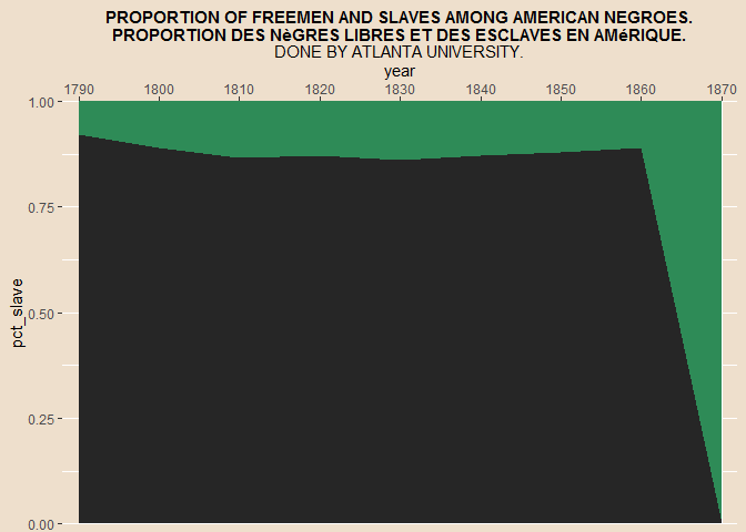
freemen <- data.frame(
  year = seq(1790, 1870, by = 10),
  pct_free = c(0.08, 0.11, 0.135, 0.13, 0.14, 0.13, 0.12, 0.11, 1)
) %>%
  dplyr::mutate(
    pct_slave = 1 - pct_free,
    # replace the last value (0%) with the previous one so that it's aligned
    # in the same place as the actual image
    labels = replace(pct_slave, n(), pct_slave[n() - 1])
  )
freemen %>% head
##   year pct_free pct_slave labels
## 1 1790    0.080     0.920  0.920
## 2 1800    0.110     0.890  0.890
## 3 1810    0.135     0.865  0.865
## 4 1820    0.130     0.870  0.870
## 5 1830    0.140     0.860  0.860
## 6 1840    0.130     0.870  0.870
ppmsca_33913 <- ggplot(
  data = freemen,
  mapping = aes(
    x = year,
    y = pct_slave
  )
) +
  geom_area(aes(y = 1),
            # 因为 max(y) <= 1
    fill = "seagreen"
  ) +
  # 建立绿底版面
  geom_area(fill = "gray15") +
  # gray15 偏黑,和 seagreen 匹配
  labs(
    title = "PROPORTION OF FREEMEN AND SLAVES AMONG AMERICAN NEGROES.\nPROPORTION DES NÈGRES LIBRES ET DES ESCLAVES EN AMÉRIQUE.",
    subtitle = "DONE BY ATLANTA UNIVERSITY."
  ) +
  scale_x_continuous(
    breaks = seq(1790, 1870, by = 10),
    # 无论是时间、自定义会比较好
    position = "top"
  ) +
  coord_cartesian(
    expand = FALSE,
    clip = "off",
    xlim = c(1788, 1872)
  ) +
  theme_du_bois()
利用 pipeline 学习每段代码,解释见注释。
ppmsca_33913
position = "top"改变了x轴的位置。hjust = 0.5使得标题和副标题居中。
ppmsca_33913 + geom_text(
  aes(
    y = labels,
    label = paste0(100 * pct_free, "%"),
    family = font_name,
    fontface = "bold"
  ),
  nudge_y = 0.03
  # nudge_x, nudge_y
  # Horizontal and vertical adjustment to nudge labels by. Useful for offsetting text from points, particularly on discrete scales.
) +
  annotate(
    "text",
    label = c("SLAVES\nESCLAVES", "FREE - LIBRE"),
    color = c("antiquewhite", "black"),
    size = c(9, 6),
    x = 1830,
    y = c(0.5, 0.97),
    family = font_name,
    fontface = "bold"
  ) +
  ### theme adjustments
  theme(
    text = element_text(face = "bold"),
    panel.background = element_blank(),
    plot.subtitle = element_text(size = 7),
    # 副标题变小
    panel.grid.major.x = element_line(color = "gray25"),
    panel.grid.minor = element_blank(),
    panel.grid.major.y = element_blank(),
    # 删除多余的网格线
    axis.text.y = element_blank(),
    # 清楚 y 百分比的 tick,毕竟已经在每个点上标记了,就不要给多余信息。
    axis.ticks = element_blank(),
    # 删除轴上的分割点,多余信息,已经对其了
    axis.title = element_blank()
    # 删除坐标轴的解释,因为已经很明显了
  )
实际上我对 ggplot 这些参数还不太熟悉,会大大提高自己的作图能力。