r_eda
饼状图,使用 ggplot2 参数美化
Jiaxiang Li 2019-03-12
参考 github
knitr::opts_chunk$set(warning = FALSE, message = FALSE)
suppressMessages(library(tidyverse))
source("theme_du_bois.R")
font_name <- "Inconsolata"
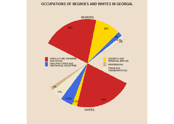
occup <- data.frame(
  race = rep(c("black", "white"), each = 6),
  job = rep(c("ag", "serv", "manu", "trade", "prof", "NA"), times = 2),
  pct = c(62, 28, 5, 4.5, 0.5, 50, 64, 5.5, 13.5, 13, 4, 50)
)
# set factor levels in order of appearance on graph from [0, pi]
occup$job <- factor(
  occup$job,
  levels = c("NA", "prof", "trade", "manu", "serv", "ag")
)
occup %>% head
##    race   job  pct
## 1 black    ag 62.0
## 2 black  serv 28.0
## 3 black  manu  5.0
## 4 black trade  4.5
## 5 black  prof  0.5
## 6 black    NA 50.0
pct_labels <- paste0(occup$pct, "%")
pct_labels[c(6, 12)] <- "" # no label for NA
pct_labels[5] <- ".5%"
ppmsca_08993 <- ggplot(
  data = occup,
  mapping = aes(
    x = 1,
    y = pct,
    fill = race:job
  )
) +
  geom_bar(
    width = 1,
    stat = "identity"
  ) +
  coord_polar(
    theta = "y",
    # changing starting position for slices to be in the right places
    start = 1.3 * pi / 2
  ) +
  labs(
    title = "OCCUPATIONS OF NEGROES AND WHITES IN GEORGIA.",
    x = NULL,
    y = NULL
  ) +
  scale_fill_manual(
    values = rep(
      # in order of the levels of job that i set earlier
      c("NA", "tan", "cornsilk2", "royalblue", "gold", "firebrick3"),
      times = 2
    ),
    # set legend breaks and labels
    # only need to specify the race:job combinations for one race so it'll
    # use the corresponding color for both halves
    breaks = paste0(
      "black:",
      c("ag", "manu", "NA", "serv", "prof", "trade")
    ),
    labels = c(
      "AGRICULTURE, FISHERIES\nAND MINING.",
      "MANUFACTURING AND\nMECHANICAL INDUSTRIES.",
      "",
      "DOMESTIC AND\nPERSONAL SERVICE.",
      "PROFESSIONS.",
      "TRADE AND\nTRANSPORTATION."
    ),
    guide = guide_legend(
      title = NULL,
      nrow = 3,
      ncol = 2,
      keywidth = 0.7,
      keyheight = 0.7,
    )
  ) +
  theme_du_bois()
ppmsca_08993
美化饼状图。
ppmsca_08993 + geom_text(
  aes(
  # need position_stack to center labels in each slice, but can't use position
  # and nudge_* together. would it work to just try different x values until i
  # find the one resulting in text at the top of each slice?
    x = 1.4,
    label = pct_labels,
    family = font_name
  ),
  position = position_stack(vjust = 0.5),
  size = 2.5
) +
  annotate(
    "text",
    label = c("NEGROES.", "WHITES."),
    x = 1.55,
    y = c(203, 50),
    size = 3,
    family = font_name
  ) +
  ### theme adjustments
  theme(
    plot.title = element_text(size = 14),
    panel.grid = element_blank(),
    panel.border = element_blank(),
    axis.ticks = element_blank(),
    axis.text = element_blank(),
    # remove white background from legend
    legend.background = element_blank(),
    legend.text = element_text(
      size = 6,
      # add more spacing between legend columns
      margin = margin(r = 70, unit = "pt")
    ),
    # move legend to the middle of plot
    legend.position = c(0.6, 0.5),
    # remove white background from legend keys
    legend.key = element_blank()
  ) +
  theme(
    plot.title = element_text(size = 10)
  )