r_eda
美化直方图和标签
suppressMessages(library(tidyverse))
library(politicaldata)
数据处理
rstudioapi::jobRunScript('code/get-data.R', path = 'code', encoding = 'UTF-8')
这里的数据处理不是重点,因此展示可以不关注。
prop_v_wta <- read_rds("data/prop_v_wta.rds")
library(wesanderson)
names(wes_palettes)
##  [1] "BottleRocket1"  "BottleRocket2"  "Rushmore1"      "Rushmore"
##  [5] "Royal1"         "Royal2"         "Zissou1"        "Darjeeling1"
##  [9] "Darjeeling2"    "Chevalier1"     "FantasticFox1"  "Moonrise1"
## [13] "Moonrise2"      "Moonrise3"      "Cavalcanti1"    "GrandBudapest1"
## [17] "GrandBudapest2" "IsleofDogs1"    "IsleofDogs2"
prop.gg <-
  prop_v_wta %>%
  mutate(y = dem_prop - 270) %>%
  # y = dem_prop - 270 在后面频繁使用,
  # 因此构建起来,减少代码的使用
  ggplot(aes(x = year,y = y)) +
  # y - 270 产生正负数
  geom_col(aes(col = y >= 0, fill = y >= 0)) +
  geom_hline(yintercept = 0,linetype = 2, col='gray60') +
  # linetype = 2 虚线
  geom_label(aes(label=paste("D:",dem_prop),
                 y = ifelse(y >= 0, y + 4, y -4),
                 # 按照正负情况打标签
                 col = y >= 0)) +
  scale_x_continuous(breaks = seq(1900, 2016, 4)) +
  scale_y_continuous(labels = function(x) x + 270,
                     # 返还 270
                     limits = c(-538 + 270,538 - 270),
                     breaks = c(0,135,270,404,538) - 270) +
  # scale_color_manual(values = c("TRUE" = "#3498DB","FALSE" = "#E74C3C")) +
  scale_color_manual(values = wes_palette("Royal1")) +
  # 按照 TRUE/FALSE 打标签不会错
  # scale_fill_manual(values=c("TRUE" = "#3498DB","FALSE" = "#E74C3C")) +
  scale_fill_manual(values = wes_palette("Royal1")) +
  labs(title="Electoral College Results Under Proportional Allocation*",
       subtitle="Under a system of proportional allocation, landslides don't happen because slim victories\nresult in nearly equal Electoral College vote allocation (and Hillary Clinton would have won in 2016)",
       x="Year",
       y="Democratic Electoral Votes",
       caption="* When discarding votes for third-party candidates")
prop.gg +
  theme_minimal() +
  theme(
    legend.position = 'none',
    plot.background = element_blank(),
    panel.grid = element_blank(),
    axis.ticks.y = element_blank(),
    axis.text.y = element_blank(),
    plot.caption = element_text(hjust = 0)
  )
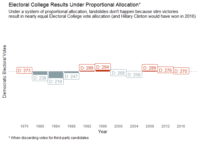
- 这是一种展示直方图的方式
- 找到均值,根据均值上下展示不同颜色,表示高低
- 这比传统的直方图,更加引人注目,说明和均值的关系
*可以认为是脚注preview是作者美化图片的函数,但是没有公开,github 上也没找到