r_eda
dot 和 bar 的比较
参考 Strayer (2019)
当表示大小时,点图是要比 bar 更加清晰。
knitr::opts_chunk$set(warning = FALSE, message = FALSE)
suppressMessages(source(here::here("R/load.R")))
who_disease <- read_csv('datasets/who_disease.csv')
interestingCountries <- c("NGA","SDN","FRA","NPL","MYS","TZA","YEM","UKR","BGD","VNM")
who_subset <- who_disease %>%
    filter(
        countryCode %in% interestingCountries,
        disease == 'measles',
        year %in% c(1992, 2002) # Modify years to 1992 and 2002
    ) %>%
    mutate(year = paste0('cases_', year)) %>%
    spread(year, cases)

# Reorder y axis and change the cases year to 1992
ggplot(who_subset, aes(x = log10(cases_1992), y = reorder(country,cases_1992))) +
    geom_point()
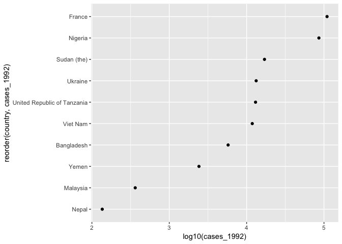
如图是查看若干国家,在 1992年疾病案件的数量比较。 但是这个图是有 track 的,感觉 Nepal 很少,我们不妨查看增长率。
who_subset %>%
    # calculate the log fold change between 2016 and 2006
    mutate(logFoldChange = log2(cases_2002/cases_1992)) %>%
    # set y axis as country ordered with respect to logFoldChange
    ggplot(aes(x = logFoldChange, y = reorder(country,logFoldChange))) +
    geom_point() +
    # add a visual anchor at x = 0
    geom_vline(xintercept = 0)
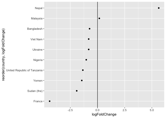
在这里会发现,
- Nepal 虽然基数最小,但是增长最快
- France 基数最大,但是增长最慢 (且是下降)
geom_vline(xintercept = 0) 给了一个 reference
line,表示1992年和2006两年案件数量没有增长和下降。
这里可以总结一下, bar 图在这里的表现就会很差,
- 使用 log 会很奇怪
- reference line 也有没 dot 图清晰
下面加入地区
who_subset %>%
    mutate(logFoldChange = log2(cases_2002/cases_1992)) %>%
    ggplot(aes(x = logFoldChange, y = reorder(country, logFoldChange))) +
    geom_point() +
    geom_vline(xintercept = 0) +
    xlim(-6,6) +
    # add facet_grid arranged in the column direction by region and free_y scales
    facet_grid(region ~ ., scales = 'free_y')
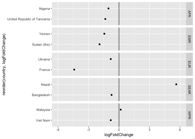
如果使用 bar,那么图片就很臃肿。
Cleaning up the bars
amr_pertussis <- who_disease %>%
    filter(   # filter data to our desired subset
        region == 'AMR',
        year == 1980,
        disease == 'pertussis'
    )
# Set x axis as country ordered with respect to cases.
ggplot(amr_pertussis, aes(x = reorder(country,cases), y = cases)) +
    geom_col() +
    # flip axes
    coord_flip()
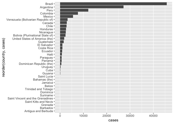
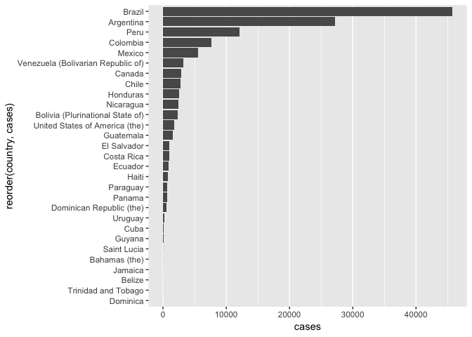
- 第一个问题是,有很多 0 cases 在,可以剔除。
- 横线可以剔除,比较碍事
amr_pertussis %>%
    # filter to countries that had > 0 cases.
    filter(cases > 0) %>%
    ggplot(aes(x = reorder(country, cases), y = cases)) +
    geom_col() +
    coord_flip() +
    theme(
    # get rid of the 'major' y grid lines
    panel.grid.major.y = element_blank()
    )
最好的方式是换成点图
amr_pertussis %>% filter(cases > 0) %>%
    ggplot(aes(x = reorder(country, cases), y = cases)) +
    # switch geometry to points and set point size = 2
    geom_point(size = 2) +
    geom_segment( aes(x=reorder(country, cases), xend= reorder(country, cases), y=0, yend= cases)) +
    # change y-axis to log10.
    scale_y_log10() +
    # add theme_minimal()
    theme_minimal() +
    coord_flip()
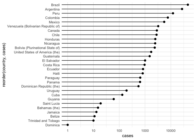
然后转换成棒棒糖图,参考 Reference
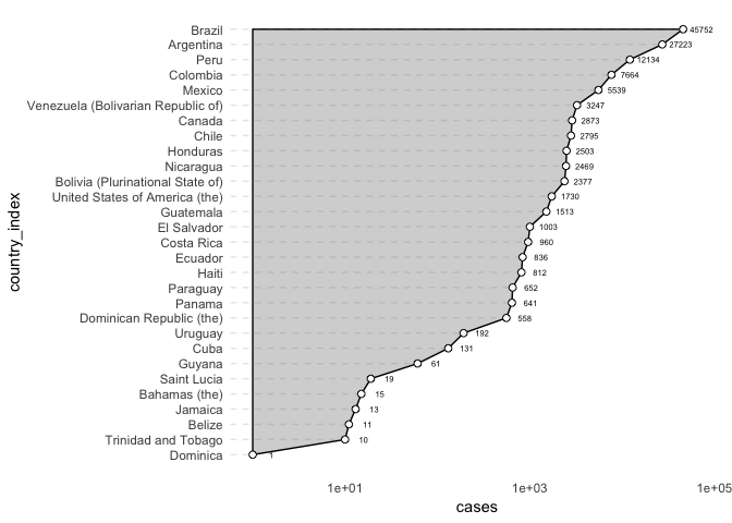
参考 WeChat Article,增加面积图使得图像更形象。
geom_point type
amr_pertussis %>% filter(cases > 0) %>%
    mutate(country = country %>% as.factor %>% fct_reorder(cases),
           country_index = country %>% as.integer) %.>%
    ggplot(data = .) +
    aes(x = country_index, y = cases) +
    geom_area(color = 'black', fill = 'black', alpha = .2) +
    geom_segment(aes(xend= country_index,
                     y=0, yend= cases),
                 colour="grey50", linetype="dashed",
                 alpha = .2
                 ) +
    geom_point(size = 2, shape = 21, fill = 'white', col = 'black') +
    # vignette("ggplot2-specs")
    # 查看 shape
    # 注意 geom_point 放在 geom_area 之后,才能够保证点中空
    scale_x_continuous(breaks = .$country_index, labels = .$country) +
    geom_text(size = 2, aes(label = cases), nudge_y = 0.2) +
    scale_y_log10() +
    # add theme_minimal()
    theme_minimal() +
    theme(
       panel.grid = element_blank()
    ) +
    coord_flip()
Strayer, Nick. 2019. “Visualization Best Practices in R.” DataCamp.
2019.
<https://www.datacamp.com/courses/visualization-best-practices-in-r>.