Display your Datset in PCA like a Bar plot
Jiaxiang Li
2019-09-28
Source:vignettes/pca_inbar.Rmd
pca_inbar.RmdI get this idea from Silge (2018)’s blog to display the result of PCA in an elegant and easily-read way. Moreover, I think it is a good practice to display the data, and show the PC1 represents what kinds of information of a dataset.
library(add2evaluation)
pca_inbar(mtcars)
#> 载入需要的程辑包:Matrix
#> ─ Attaching packages ────────────────────────────── tidyverse 1.2.1 ─
#> ✔ ggplot2 3.1.0       ✔ purrr   0.2.5
#> ✔ tibble  2.1.1       ✔ dplyr   0.8.0.1
#> ✔ tidyr   0.8.2       ✔ stringr 1.4.0
#> ✔ readr   1.1.1       ✔ forcats 0.3.0
#> ─ Conflicts ─────────────────────────────── tidyverse_conflicts() ─
#> ✖ dplyr::between()   masks data.table::between()
#> ✖ tidyr::expand()    masks Matrix::expand()
#> ✖ dplyr::filter()    masks stats::filter()
#> ✖ dplyr::first()     masks data.table::first()
#> ✖ dplyr::lag()       masks stats::lag()
#> ✖ dplyr::last()      masks data.table::last()
#> ✖ purrr::transpose() masks data.table::transpose()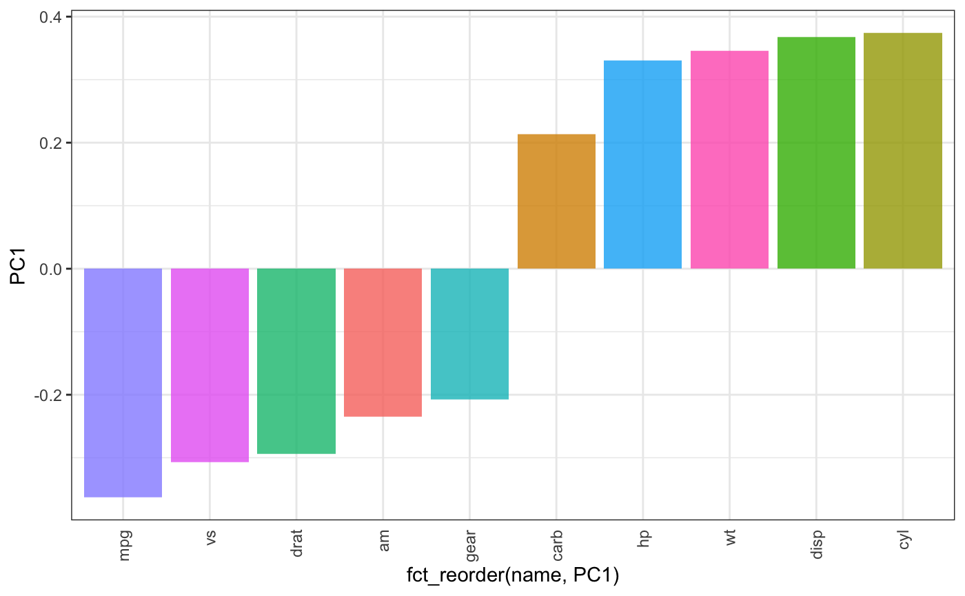
Reference
Silge, Julia. 2018. “Supervised Learning in R: Case Studies.” 2018. https://campus.datacamp.com/courses/supervised-learning-in-r-case-studies/get-out-the-vote?ex=9.